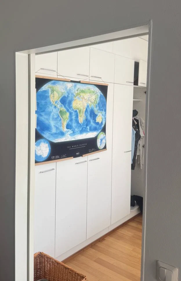
The World Painted

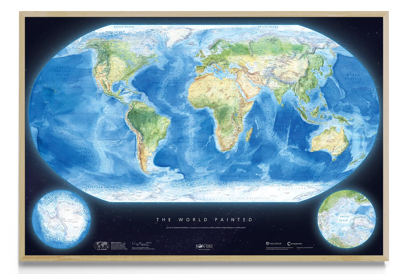
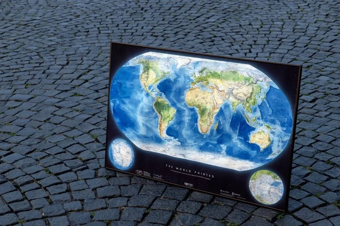
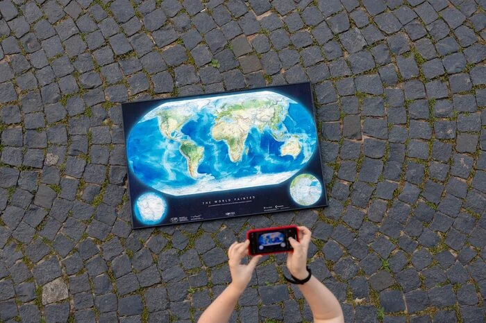
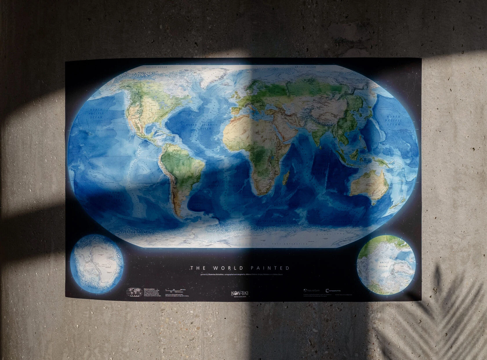
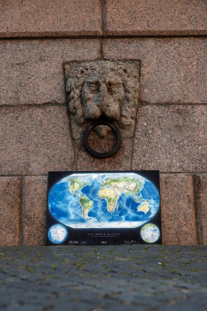
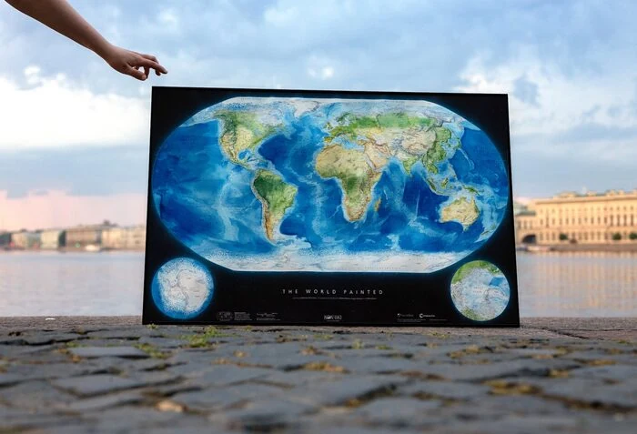
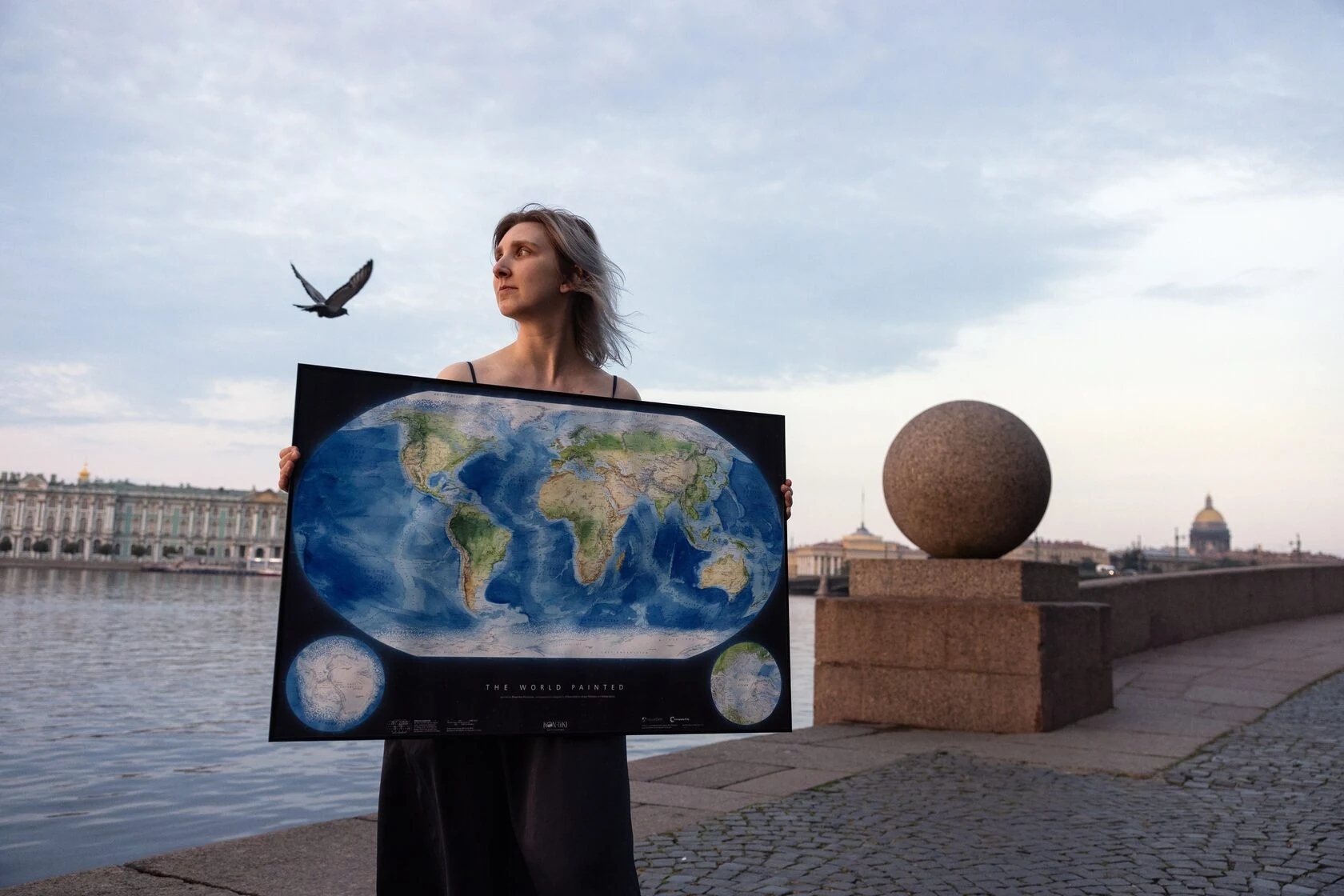
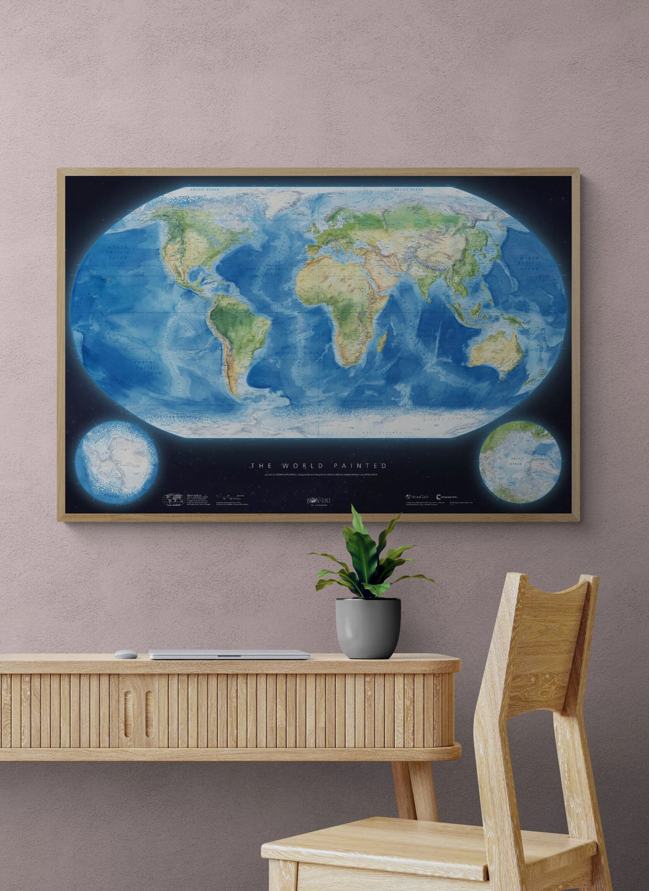
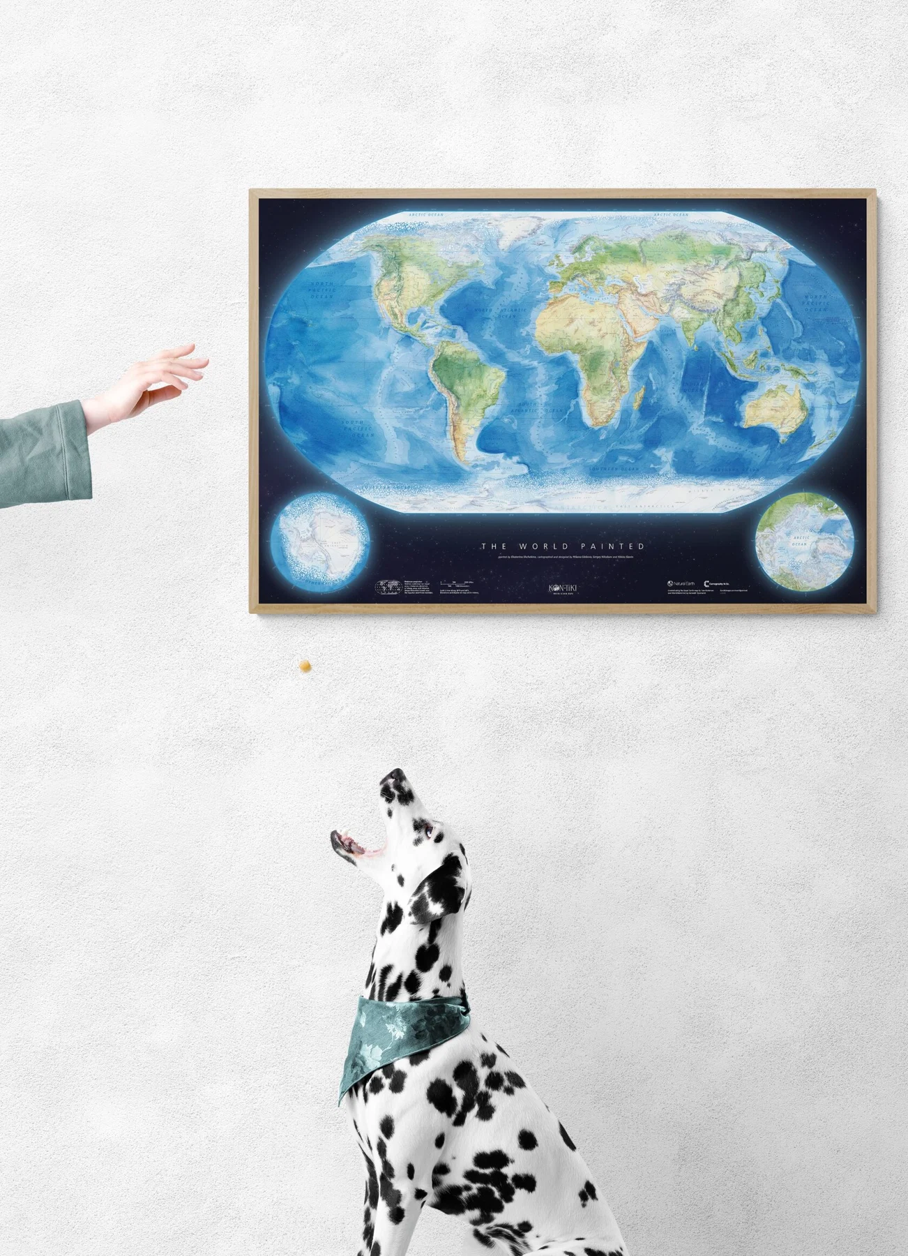
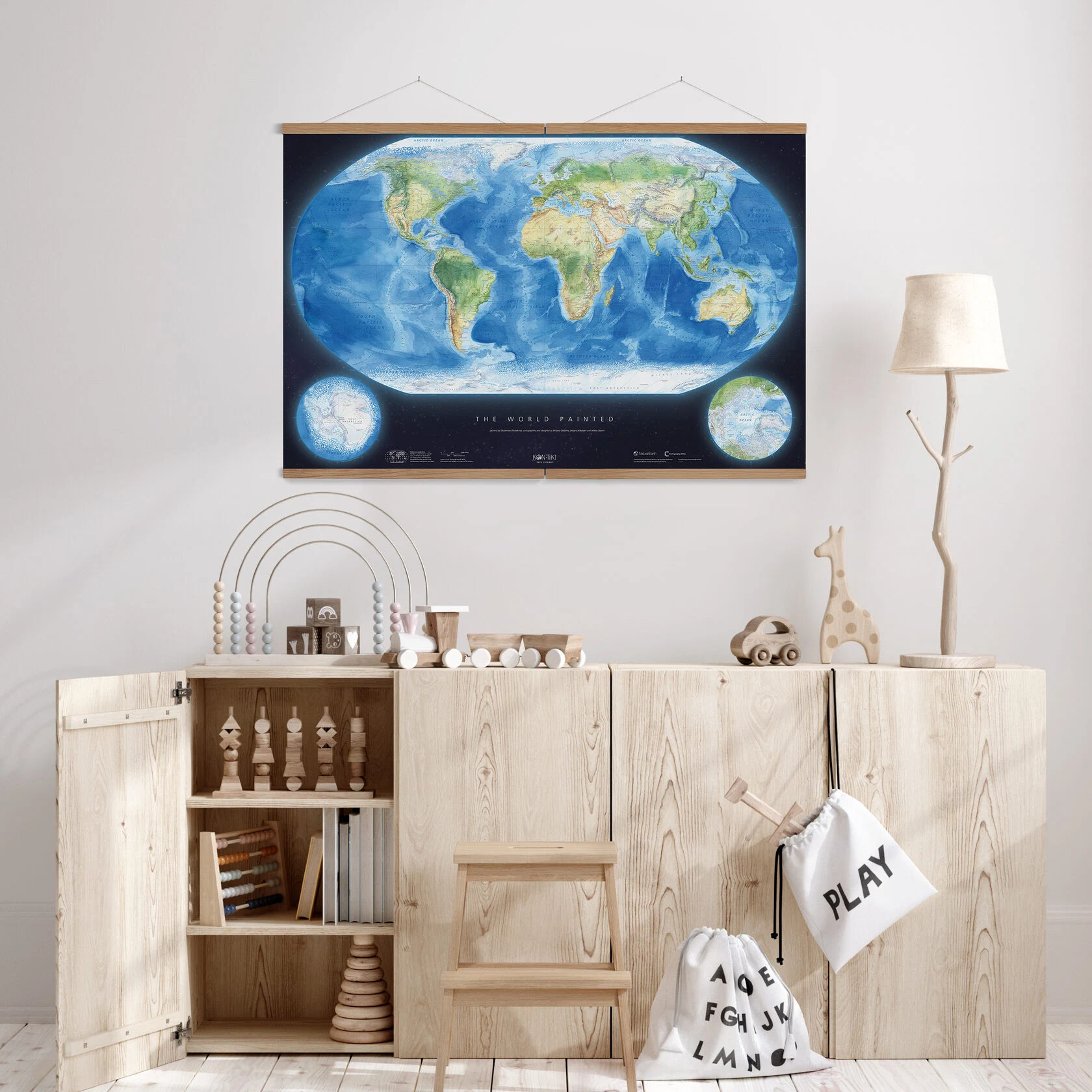
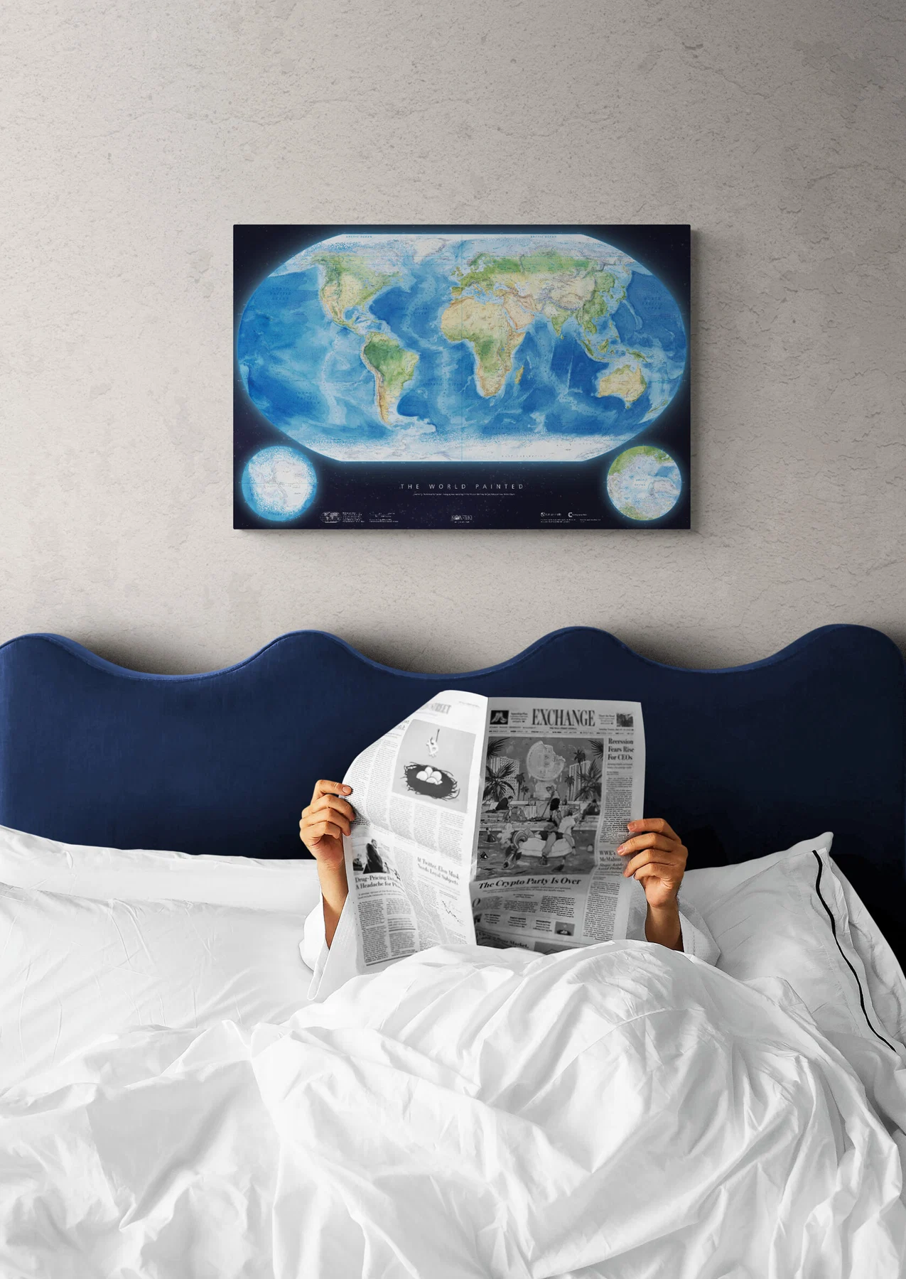
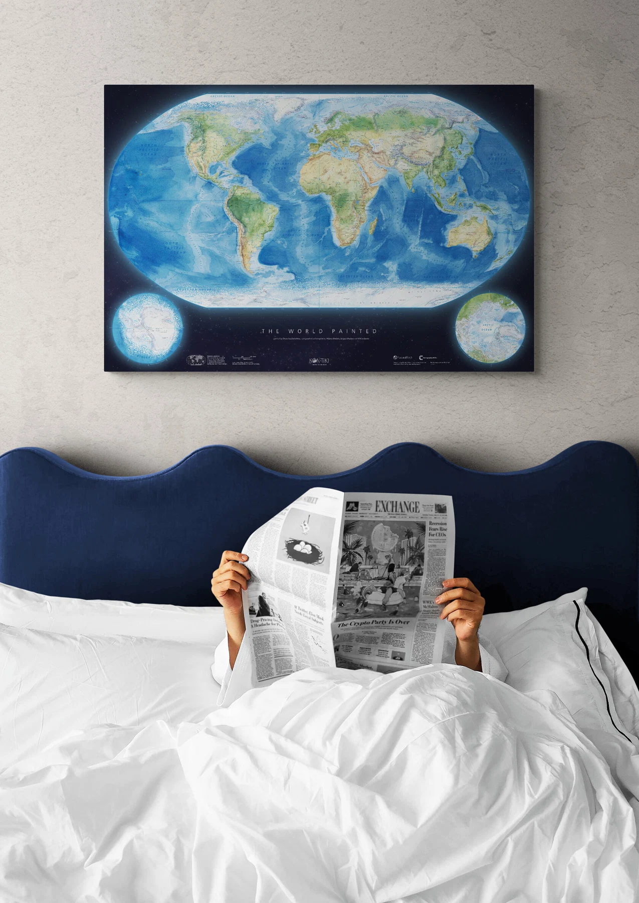
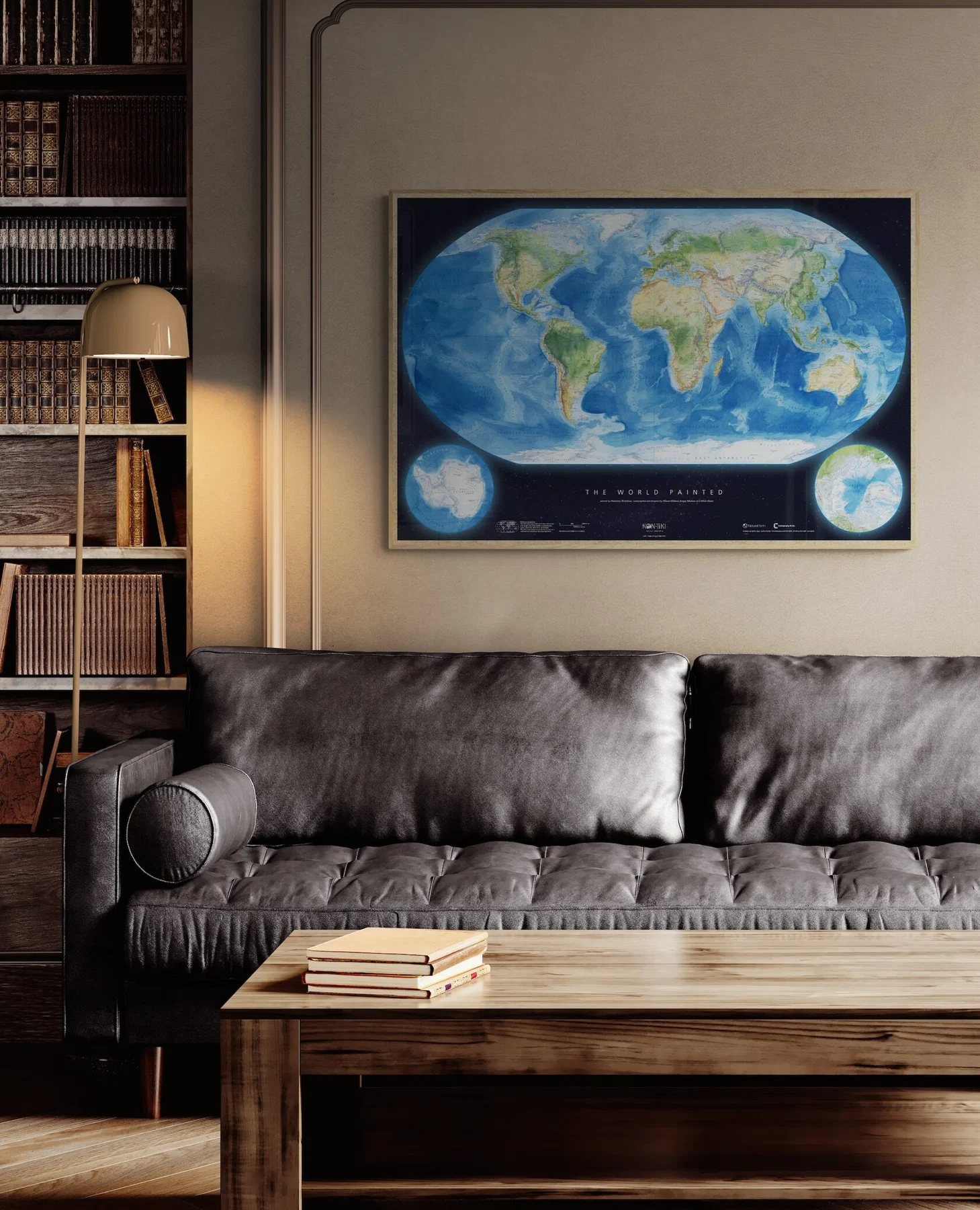
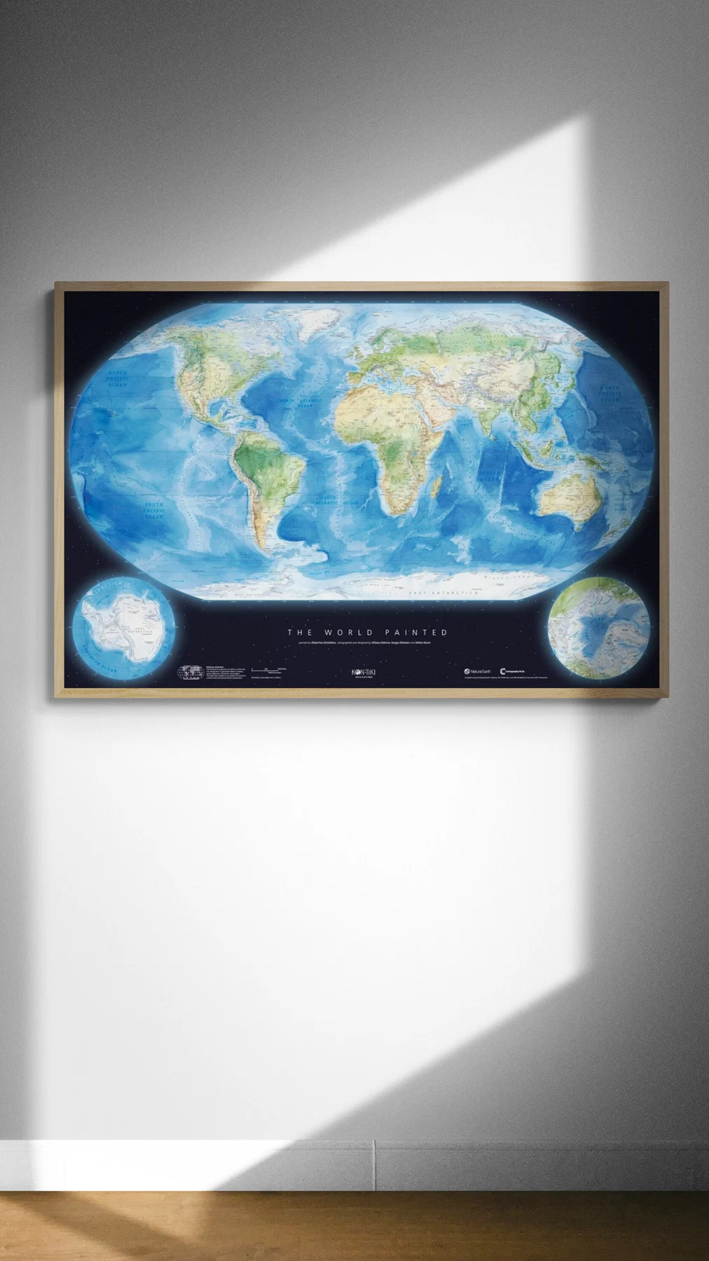
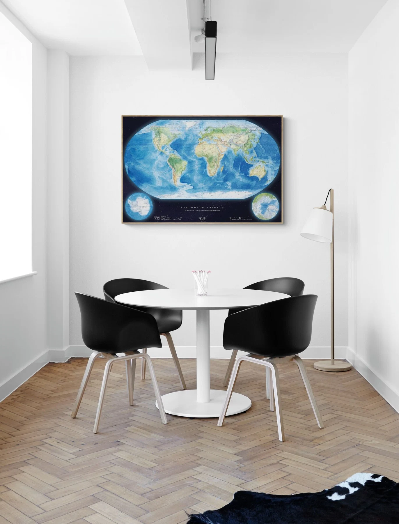
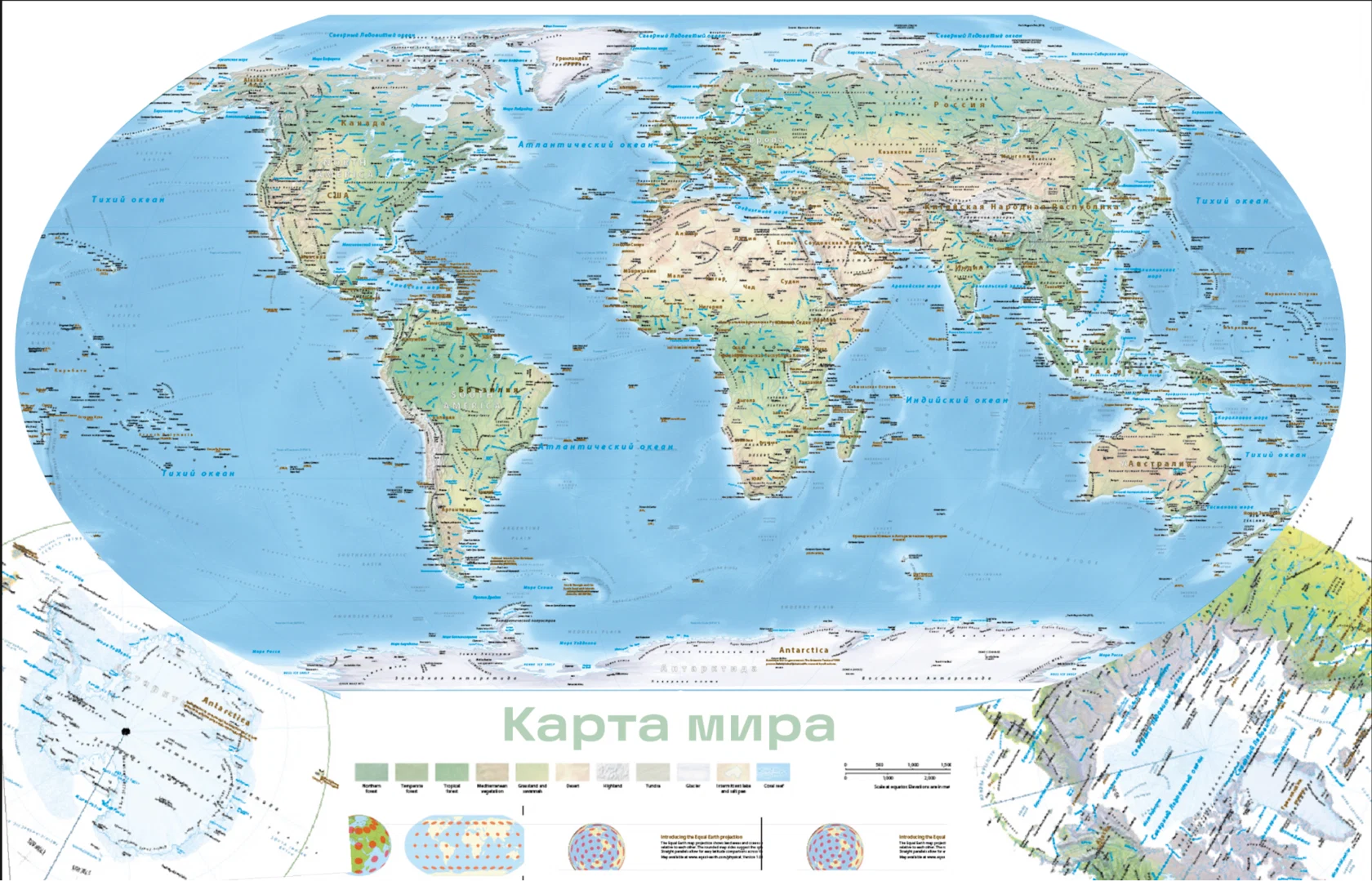
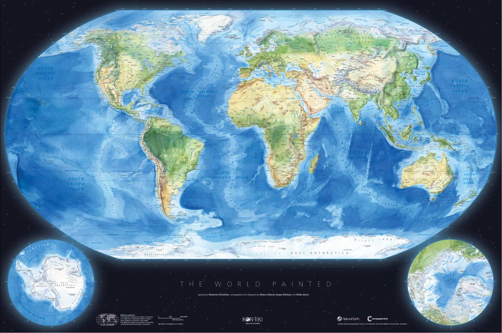
A physical world wall map with a hand-painted watercolour basemap and pioneering cartographic design.
A labour of love, it is designed to be both beautiful and genuinely useful.
A labour of love, it is designed to be both beautiful and genuinely useful.
ORDERfrom € 75
A cartographer's dream
“One of the reasons I started this project was that when friends asked me,
‘Where can I find a good world map for my child or living room?’ — I didn’t have an answer.
We believe The World Painted can become a well-loved map for any setting.”
‘Where can I find a good world map for my child or living room?’ — I didn’t have an answer.
We believe The World Painted can become a well-loved map for any setting.”
Nikita Slavin 💙
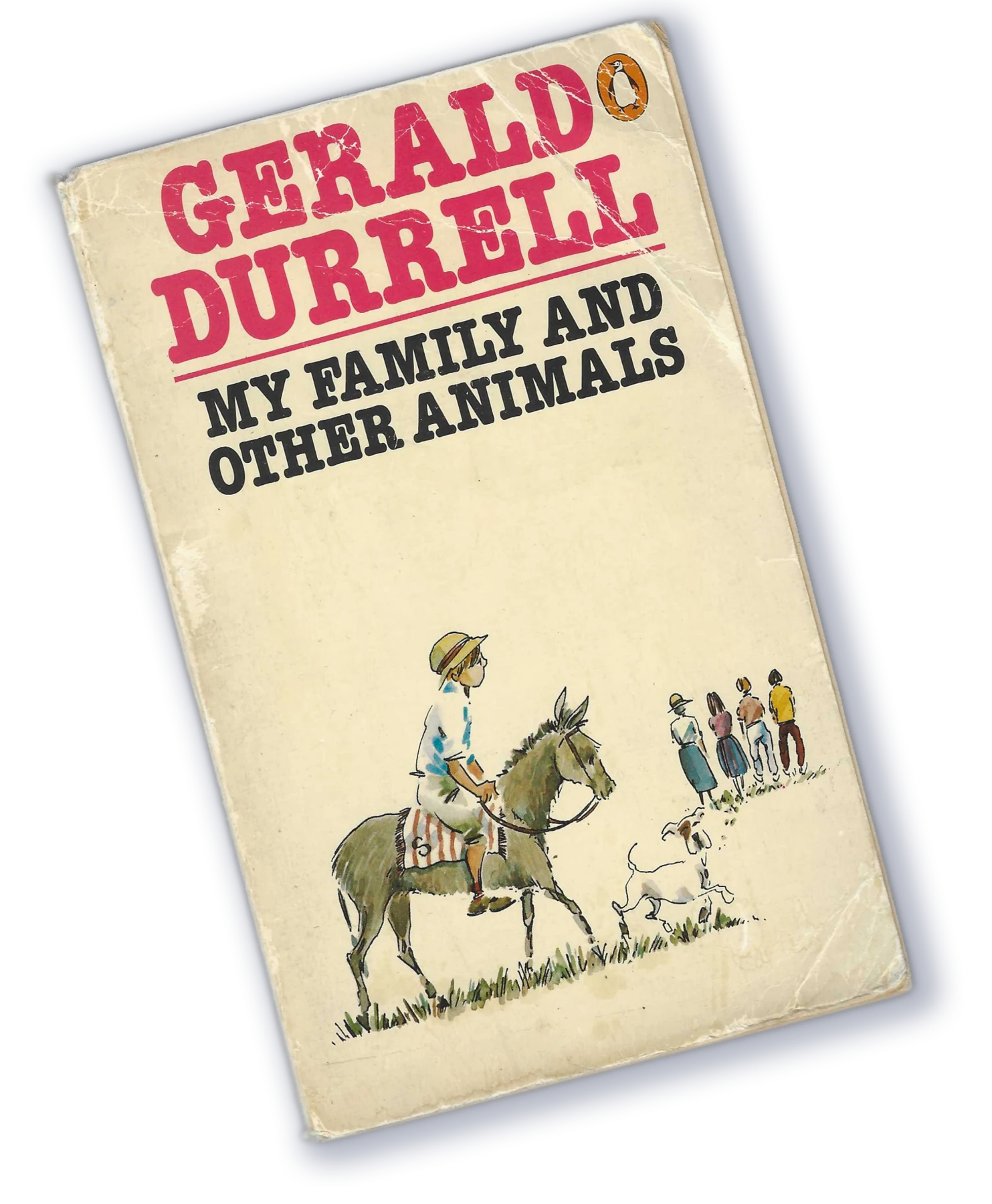
“They were maps that lived, maps that one could study, frown over, and add to; maps, in short, that really meant something.”
To create a map like that — a map that lives,
that invites you to explore the world through it, we painted the basemap by hand, then designed each layer one by one, blending the craft of classic cartography with the modern design tools power.
Every label was placed with care, every detail refined until the map felt clear, balanced, and
alive.
that invites you to explore the world through it, we painted the basemap by hand, then designed each layer one by one, blending the craft of classic cartography with the modern design tools power.
Every label was placed with care, every detail refined until the map felt clear, balanced, and
alive.
Watercolour magic
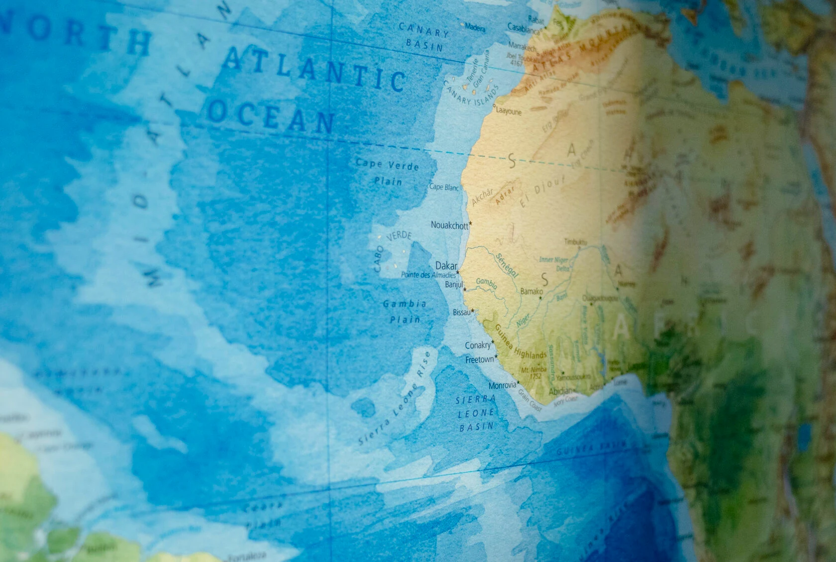
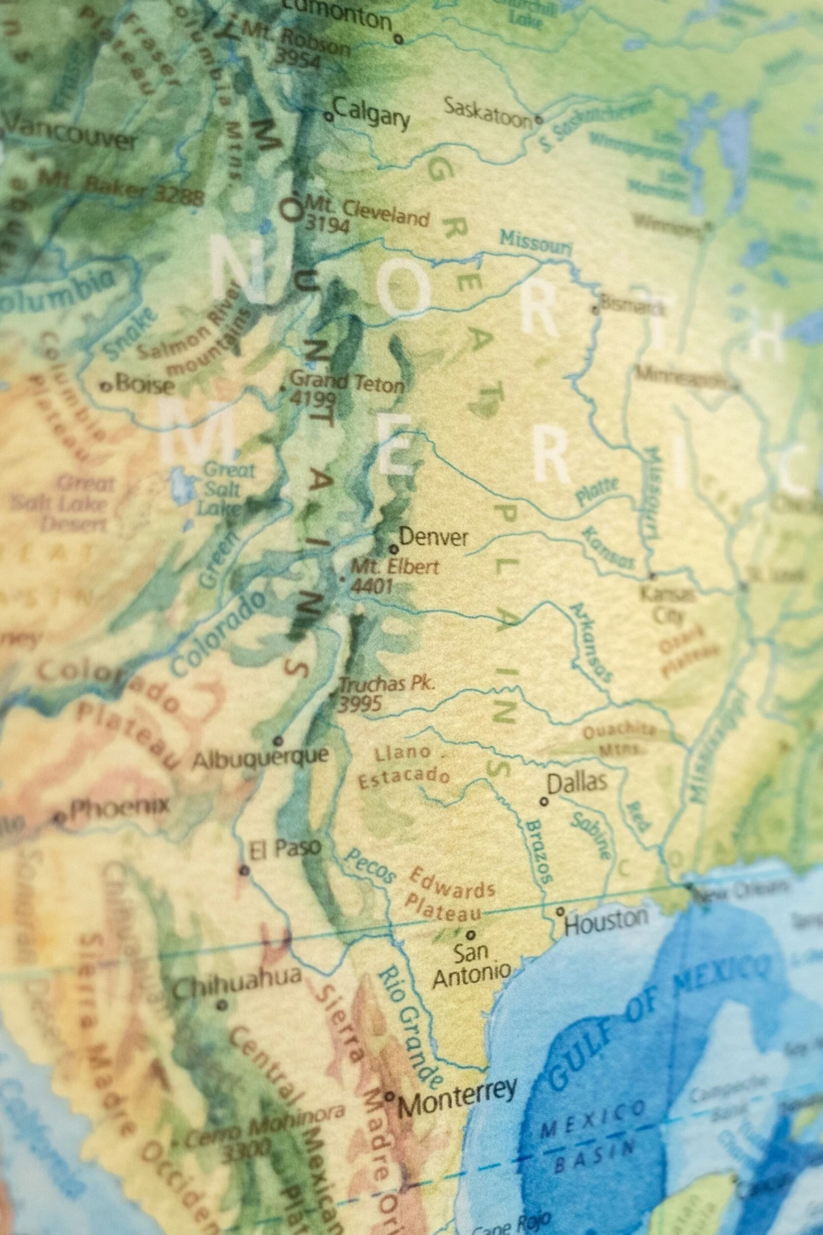
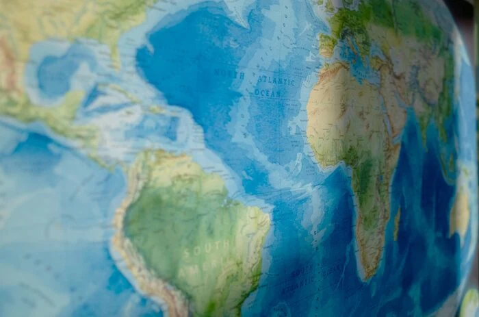
The basemap is a true work of art — a watercolour rendering of nature that depicts mountains, plains, ocean floors, seas, and polar ice.
Multiple days of careful work went into it — the result is an image that’s not only beautiful but also allows you to intuitively explore the landscape.
But remember, it’s more than just a picture. It’s a map built on accurate elevation and
landform data.
Multiple days of careful work went into it — the result is an image that’s not only beautiful but also allows you to intuitively explore the landscape.
But remember, it’s more than just a picture. It’s a map built on accurate elevation and
landform data.
Loading the map…
The fine details
The map presents the physical world with clarity and balance, free from noise and clutter. With over 2,000 carefully placed labels, it offers plenty for the geography nerd in all of us to explore.
Don’t miss the detailing of the 🔎 sea ice — solid where it remains year-round, scattered where it comes and goes,
🔎 Amazon rainforest — the planet’s vast green heart, unbroken across South America,
🔎 Norway’s fjords — deep blue cuts into the land, where sea and mountains intertwine (and our artist Ekaterina’s dream to trace them one day).
Don’t miss the detailing of the 🔎 sea ice — solid where it remains year-round, scattered where it comes and goes,
🔎 Amazon rainforest — the planet’s vast green heart, unbroken across South America,
🔎 Norway’s fjords — deep blue cuts into the land, where sea and mountains intertwine (and our artist Ekaterina’s dream to trace them one day).
We chose 🔎 the Robinson projection to fit the globe onto a flat surface. The additional 🔎 polar insets make the high latitudes easy to read. Don’t miss the 🔎 research stations!
The whole map rests on a 🔎 starry backdrop — a quiet nod to the old maps where Earth floated on turtles.
The whole map rests on a 🔎 starry backdrop — a quiet nod to the old maps where Earth floated on turtles.
2,051 labels
2051 labels on the main map, including:
— 426 settlements and polar stations 🏙️❄️
— 292 landforms ⛰️
— 254 rivers 🏞️
— 241 islands 🏝️
— 201 seas, oceans, straits, and bays 🌊
— 166 underwater features 🌊⬇️
— 152 mountain peaks 🏔️
— 80 lakes 🐟
— 50 deserts 🏜️
— 46 capes 🌬️
— 43 peninsulas 📍
— 38 regions 🗺️
— 23 coastlines 🧭
— 11 glaciers 🧊
— 11 salt flats 🧂
— 7 continents 🌍
— 6 lowlands 🌾
— 4 waterfalls 💦
plus 110 in Antarctica 🧊🇦🇶 and 194 in the Arctic ❄️🧭.
— 426 settlements and polar stations 🏙️❄️
— 292 landforms ⛰️
— 254 rivers 🏞️
— 241 islands 🏝️
— 201 seas, oceans, straits, and bays 🌊
— 166 underwater features 🌊⬇️
— 152 mountain peaks 🏔️
— 80 lakes 🐟
— 50 deserts 🏜️
— 46 capes 🌬️
— 43 peninsulas 📍
— 38 regions 🗺️
— 23 coastlines 🧭
— 11 glaciers 🧊
— 11 salt flats 🧂
— 7 continents 🌍
— 6 lowlands 🌾
— 4 waterfalls 💦
plus 110 in Antarctica 🧊🇦🇶 and 194 in the Arctic ❄️🧭.
Reviews
1 / 12
The Collector’s Print
Limited run of 50 prints.
Each one comes with a certificate of authenticity, hand-signed by the authors and individually numbered.
The map is produced on Hahnemühle German Etching — an archival-quality paper with a rich texture and gallery-grade finish.
By purchasing The Collector’s Print, you are not just buying a map — you are supporting independent cartography and helping bring our future cartographic projects to life.
Each one comes with a certificate of authenticity, hand-signed by the authors and individually numbered.
The map is produced on Hahnemühle German Etching — an archival-quality paper with a rich texture and gallery-grade finish.
By purchasing The Collector’s Print, you are not just buying a map — you are supporting independent cartography and helping bring our future cartographic projects to life.
€ 370Order

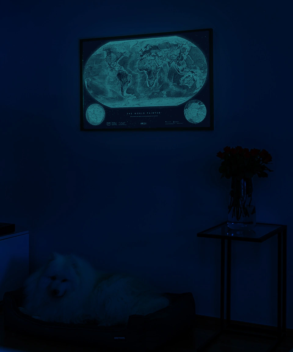
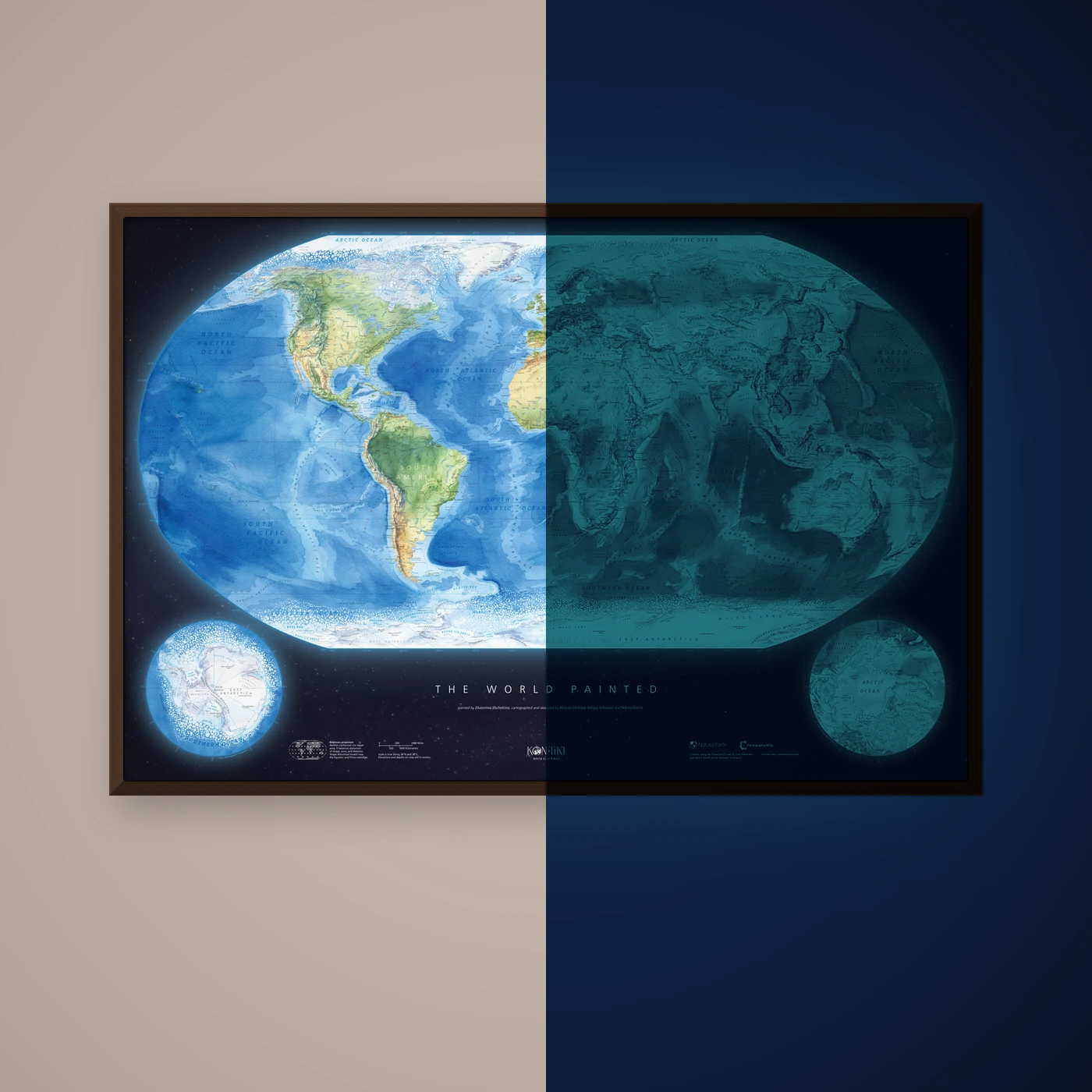
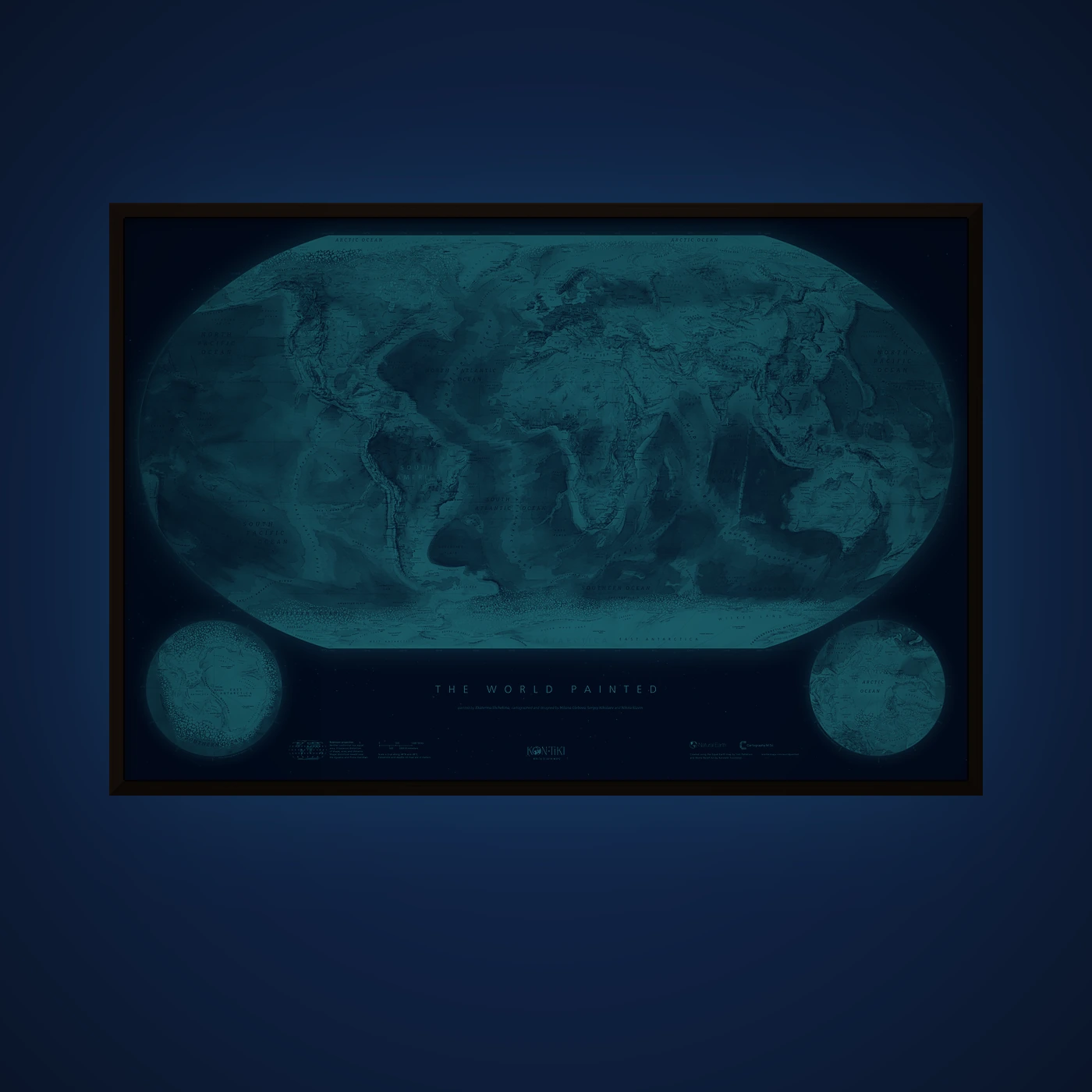
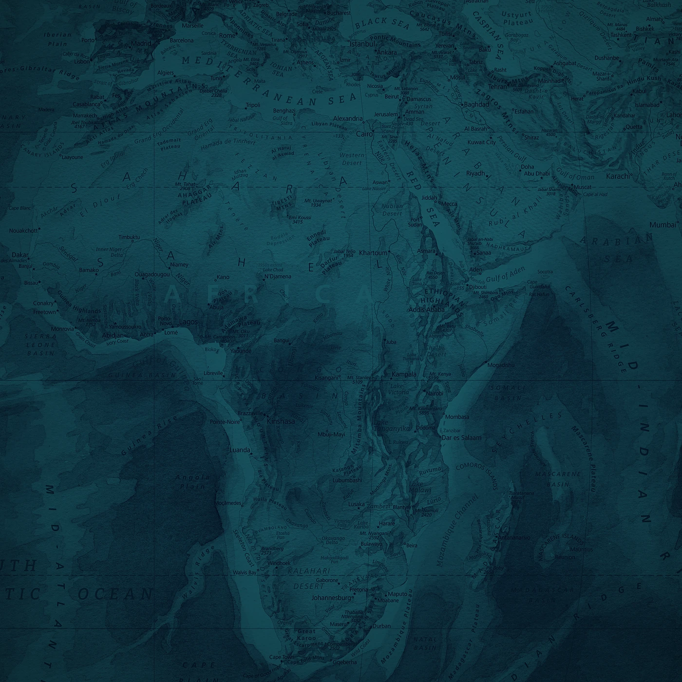
Lights out!
Remember the glowing stars above your bed as a kid? Same magic, only the whole world (the stars are there, too).
Switch off the light and the map glows gently. It isn’t very bright, but in a dark, dark room, it’s genuinely impressive.
Glow in the dark edition · 91 × 61 cm
€ 95Order
1 / 13
The World Painted
€ 75
taxes included.
Free Shipping with every order.
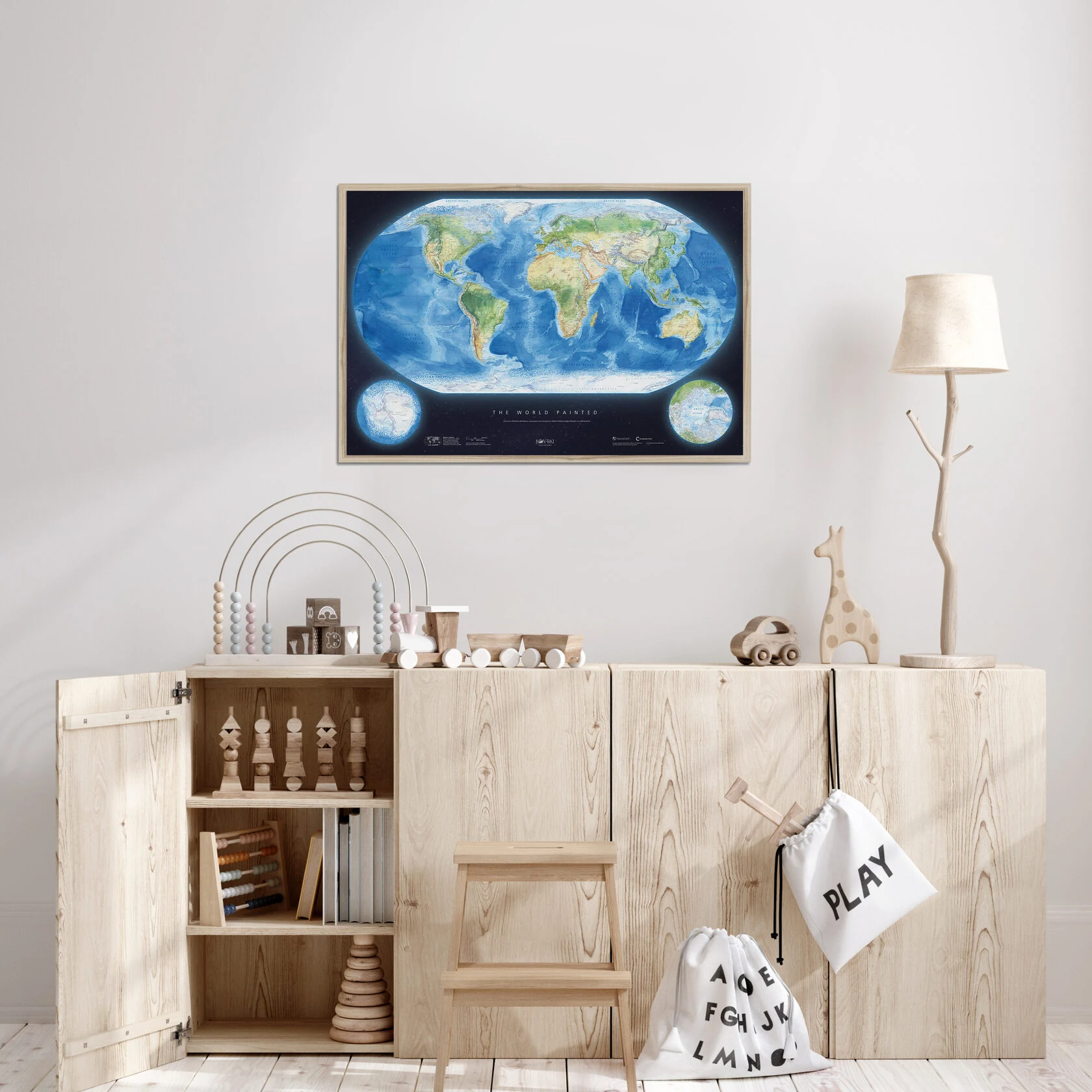
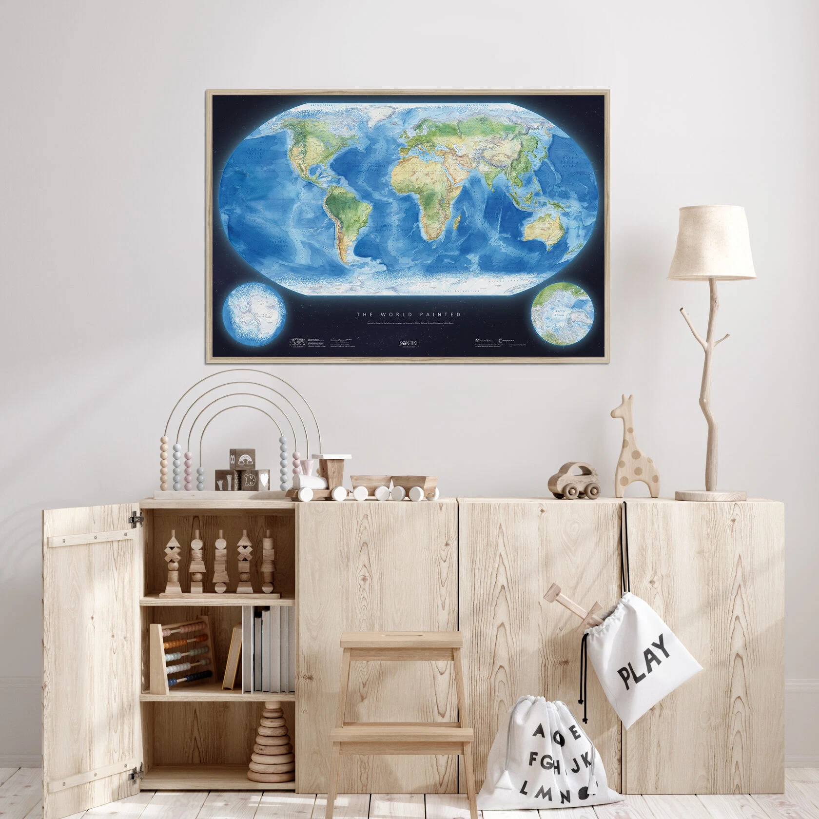
A museum-quality Giclée print on Enhanced Matte Art — velvety smooth, heavyweight paper with deep colours and long-lasting quality.
A classic format that fits any interior.
Comes unframed, rolled and safely packed in a cardboard tube.
ORDERMeet the team
Maps are a very particular kind of love — and somehow, they just turn up on their own. Back in school, I confidently joined the orienteering club at a youth centre. I think it was a mix of things: a pull towards nature, towards maps, and maybe a bit of everything else, too.
Later, when I was finishing a maths-and-physics lycée, most of my classmates were heading straight into IT or engineering. I wanted to take a different path — something less obvious. So I chose the Faculty of Geography, specialising in cartography and geoinformatics — a choice made entirely out of passion.
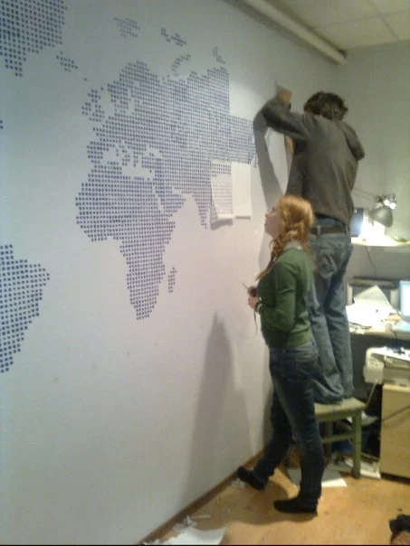
As for the first map I ever made… well, the first one I took part in was still at school: at that orienteering club, we travelled to Camp Orlyonok to map the grounds for orienteering. The first map I truly made myself came a bit later — with friends, whom I paid in beer — when we turned one wall of my first flat into a world map using hand-cut stencils.
Part of my childhood was spent in Siberia, and from time to time, our whole family would travel by train across vast distances.
And by “vast,” I mean journeys that took three days or more — one way.
Later, we moved to Kirov. At school, I loved studying the maps in the geography classroom, trying to estimate how long it would take to travel from one place to another by train. I enjoyed that feeling — when a few centimetres on paper translated into days on the move.
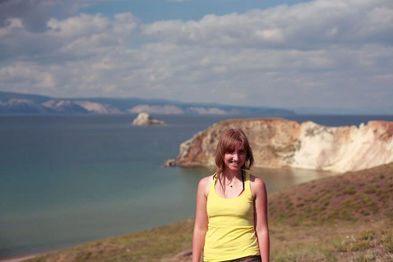
As I got older, I realised that I had grown up not far from Lake Baikal. Not far by Siberian standards, at least — just 700 kilometres away. That thought wouldn’t leave me alone. So my very first solo trip was to Baikal.
Distance wasn’t an issue: I didn’t have much money, but I had plenty of time. The route took me through the town where I’d once lived. In total, I spent seven days on a train, nineteen on a bus, and ten hours in a shared taxi — all for a few days on an island in the middle of Baikal, to make a childhood dream come true.
And it was wonderful.
To this day, I still love looking at maps and imagining how long it would take to reach different corners of the world.
I don’t have any heartwarming childhood stories to tell—there were no maps hanging on the walls, and when I read Treasure Island, I was more into the adventures than the endpaper map.
But I clearly remember a moment at university, studying geography and writing my thesis on Europe’s energy networks, when it hit me:I could write dozens of pages of text—or I could tell the same story with a few maps. And it would be clearer, more engaging, and much more enjoyable to make.
Back in 2015, those black-background maps with bright cyan lines weren’t yet mainstream, but they were the perfect metaphor for electricity. I drew them—God forgive me—in CorelDraw, and honestly, I’m still not ashamed of them. Technically, they were far from perfect, but they were bold, clear, and genuinely told the story better than pages and pages of writing.
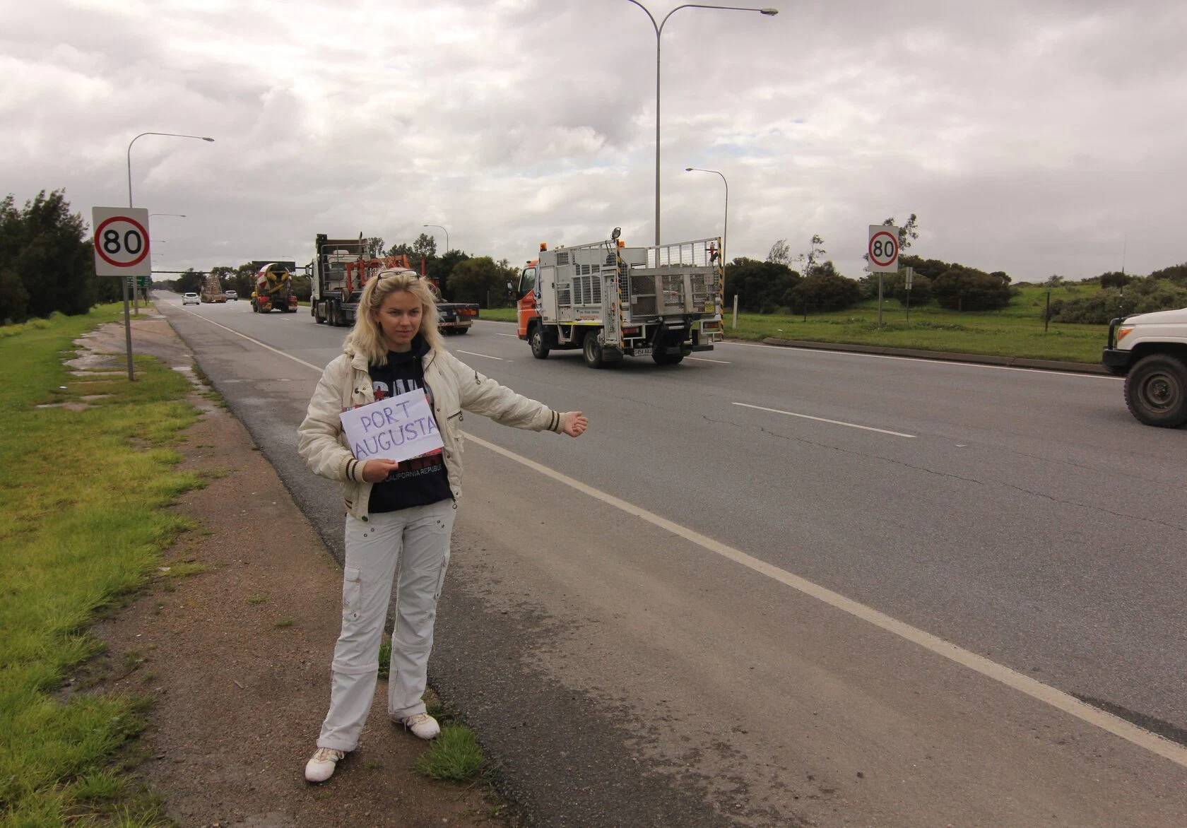
Since then, I’ve seen maps primarily as a way to tell stories. And it works the other way too: when you’re placing labels, you end up lingering over each area, and the more familiar the place, the more carefully you treat it. I especially enjoy labelling Australia and remembering hitchhiking across the Nullarbor desert, or recalling sketching a little Alpine valley in pencil and black ink, or getting lost in Bill Bryson’s tales of the Appalachians.
I believe that once a place comes alive in the mind of the cartographer, artist, or designer, it’s impossible to treat it carelessly.
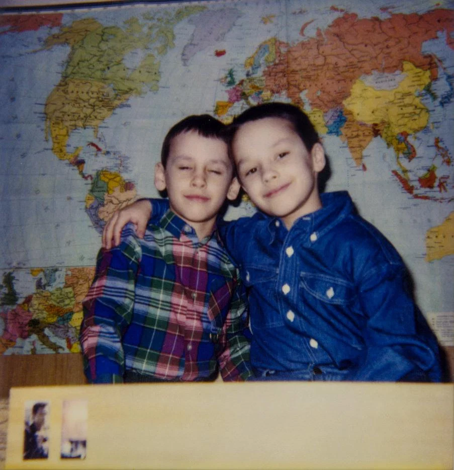
It’s always fascinating to discover traces of one’s present occupation in the artefacts of childhood. Above my bed hung a large – in my memory, absolutely enormous – world map (judging by a photograph, it must have been at a scale of 1:20 million, in Ginzburg’s polyconic projection).
I would pore over it constantly, imagining the arduous journey across the Atlantic and Pacific undertaken by that small red fragment marked “USSR”, separated from the main mass of the same colour, to reach the upper left corner of the map and become Chukotka.
The map above my bed may not have set the course of my life in its entirety, yet it seems to have left its mark: I still feel a sense of reverence towards maps; for many years I have carefully gathered images of those that caught my eye into a folder-collection on my computer; and when, decades later, I had the chance to take part in making a map myself, I embraced it as a rare opportunity to step into the mystery I had once only admired from afar.
The process
Starting a project like this feels easy and undaunting.
At first, you think you’ll manage on experience alone — something quick, light, and elegant.
In reality The World Painted turned out to be the longest, most beautiful, and at times the most complicated map I have ever made. Without a magical team working alongside me, it would not have been possible.
At first, you think you’ll manage on experience alone — something quick, light, and elegant.
In reality The World Painted turned out to be the longest, most beautiful, and at times the most complicated map I have ever made. Without a magical team working alongside me, it would not have been possible.
Nikita Slavin
cartographer
After a successful collaboration producing World. Pacific Ocean View I still had still more ideas that I wanted to bring to life. The cartographer in me had fully embraced the magical intersection of watercolour and cartography and was yelling: let’s make more!
The plan was simple: take Natural Earth data (beautifully packaged in the Equal Earth projection by Tom Patterson), reproject it onto our watercolour basemap, add labels, and publish. And that’s more or less how it went, except it took three years instead of three months!
The plan was simple: take Natural Earth data (beautifully packaged in the Equal Earth projection by Tom Patterson), reproject it onto our watercolour basemap, add labels, and publish. And that’s more or less how it went, except it took three years instead of three months!
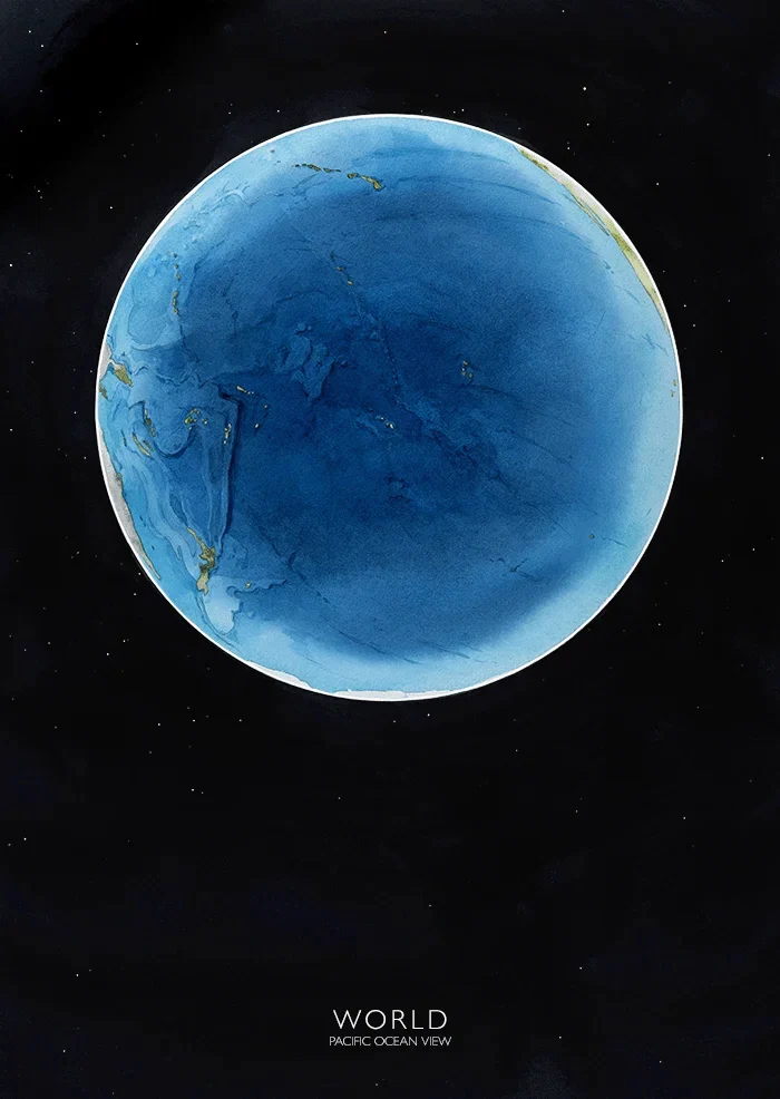
I truly love cartography as an art form. In my projects, I always strive to find the balance — between perfectionism, artistic expression, mathematical and factual accuracy and simply getting things done.
Whenever my friends asked me, “Where can I find a good world map?”, I never found a proper answer. If I’m being honest, I don’t like most of what you find in shops or online.
So… we made our own.
Whenever my friends asked me, “Where can I find a good world map?”, I never found a proper answer. If I’m being honest, I don’t like most of what you find in shops or online.
So… we made our own.
The first step was choosing a projection.
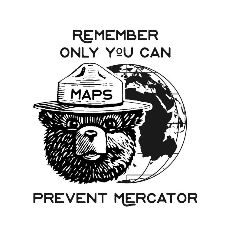
The dominance of the Mercator projection in world maps is a real problem — it shapes a distorted view of the world in people’s minds (just take a look at any size comparison website).
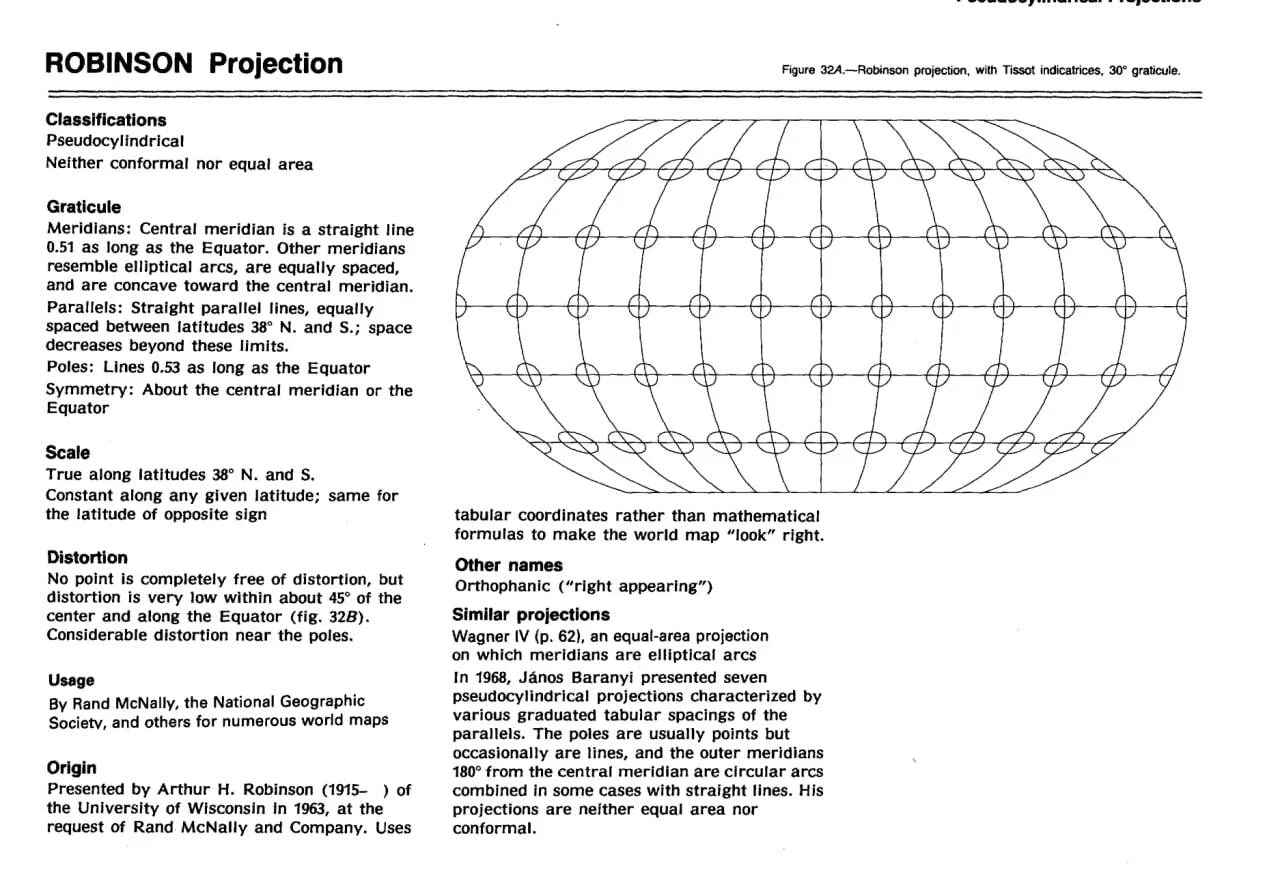
When we were deciding on our projection, we opted for a slightly more conservative approach than the Equal Earth and selected the classic Robinson projection — enhanced with two polar insets to better represent the entire planet.
The dominance of the Mercator projection in world maps is a real problem — it shapes a distorted view of the world in people’s minds (just take a look at any size comparison website).
When we were deciding on our projection, we opted for a slightly more conservative approach than the Equal Earth and selected the classic Robinson projection — enhanced with two polar insets to better represent the entire planet.
Meanwhile, Sergey began sketching layout options (since we print on demand, we had to work with a fixed set of sizes), while Katya started painting the watercolour base (you can ind their behind-the-scenes stories in their own sections).
Things were starting to take shape!
Things were starting to take shape!
Sergey Nikolaev
designer
The use of the Robinson projection inevitably poses a challenge: how to fit a map of such shape onto a rectangular sheet of paper.
This may seem a rather dull technical task, yet in reality the “framing” affects the perception of the map no less than its very “content”; it can either heighten the overall impression or completely undo the results of someone else’s hard work.
The task is further complicated by the need to accommodate polar insets and to work within the aspect ratios predetermined by the printing process. Plenty of food for thought!
This may seem a rather dull technical task, yet in reality the “framing” affects the perception of the map no less than its very “content”; it can either heighten the overall impression or completely undo the results of someone else’s hard work.
The task is further complicated by the need to accommodate polar insets and to work within the aspect ratios predetermined by the printing process. Plenty of food for thought!
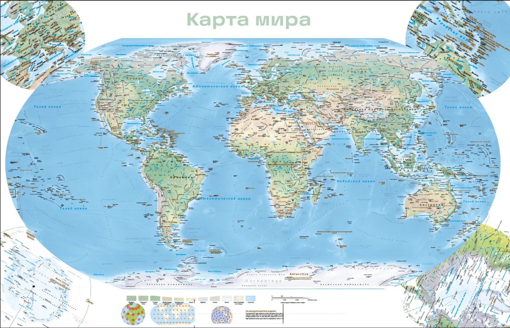
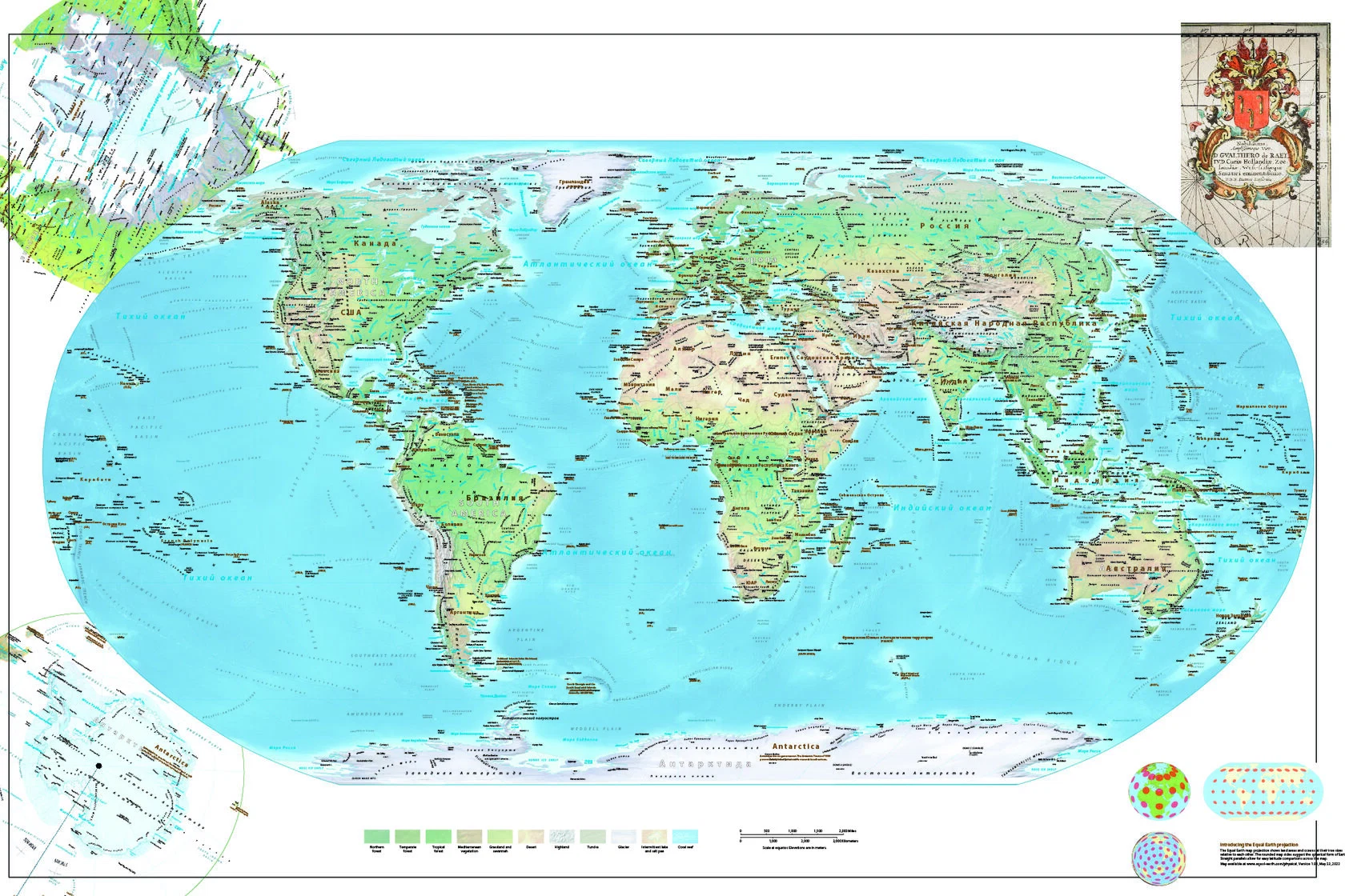
We are trying to determine how best to combine the main map with the polar insets.
The corners of the layout naturally suggest themselves for their placement, yet as there are four of them, our first instinct is to attempt to occupy all corners with something.
Perhaps a cartouche, or an inset of particularly dense areas (Europe, the Caribbean), could be placed there?
The corners of the layout naturally suggest themselves for their placement, yet as there are four of them, our first instinct is to attempt to occupy all corners with something.
Perhaps a cartouche, or an inset of particularly dense areas (Europe, the Caribbean), could be placed there?
The form of the Robinson projection lends itself naturally to presenting the map within an oval.
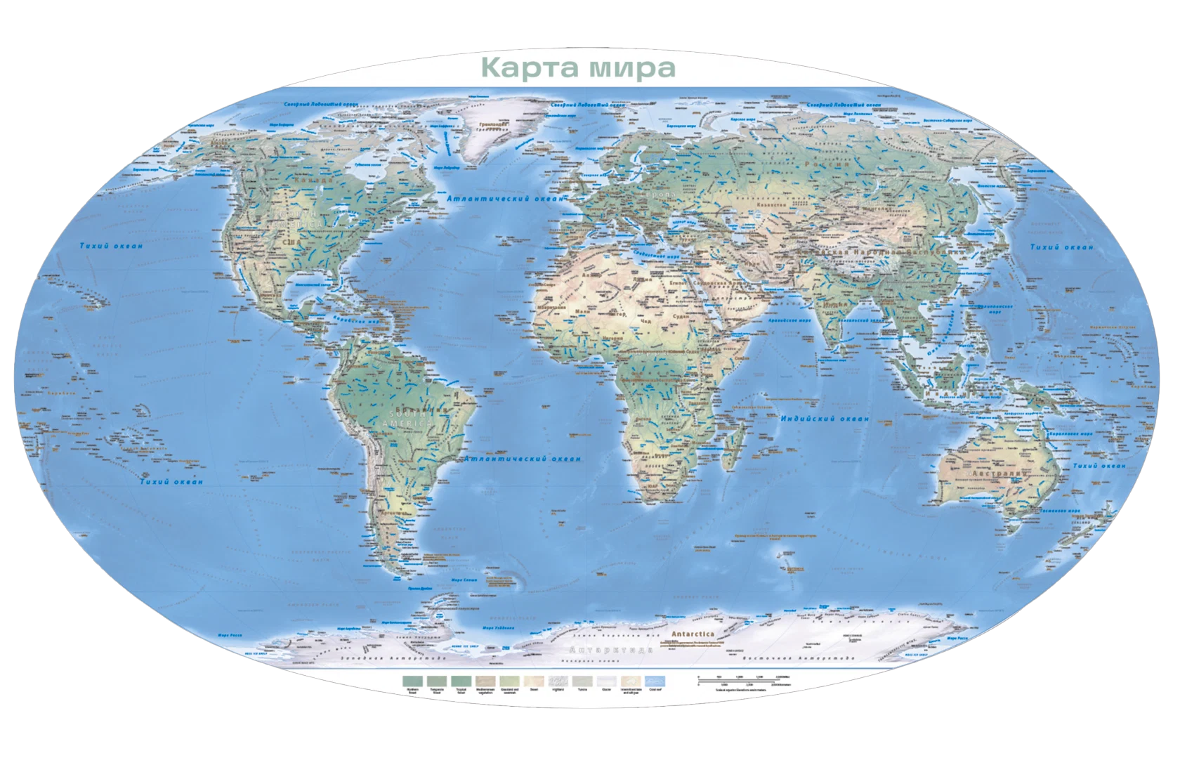
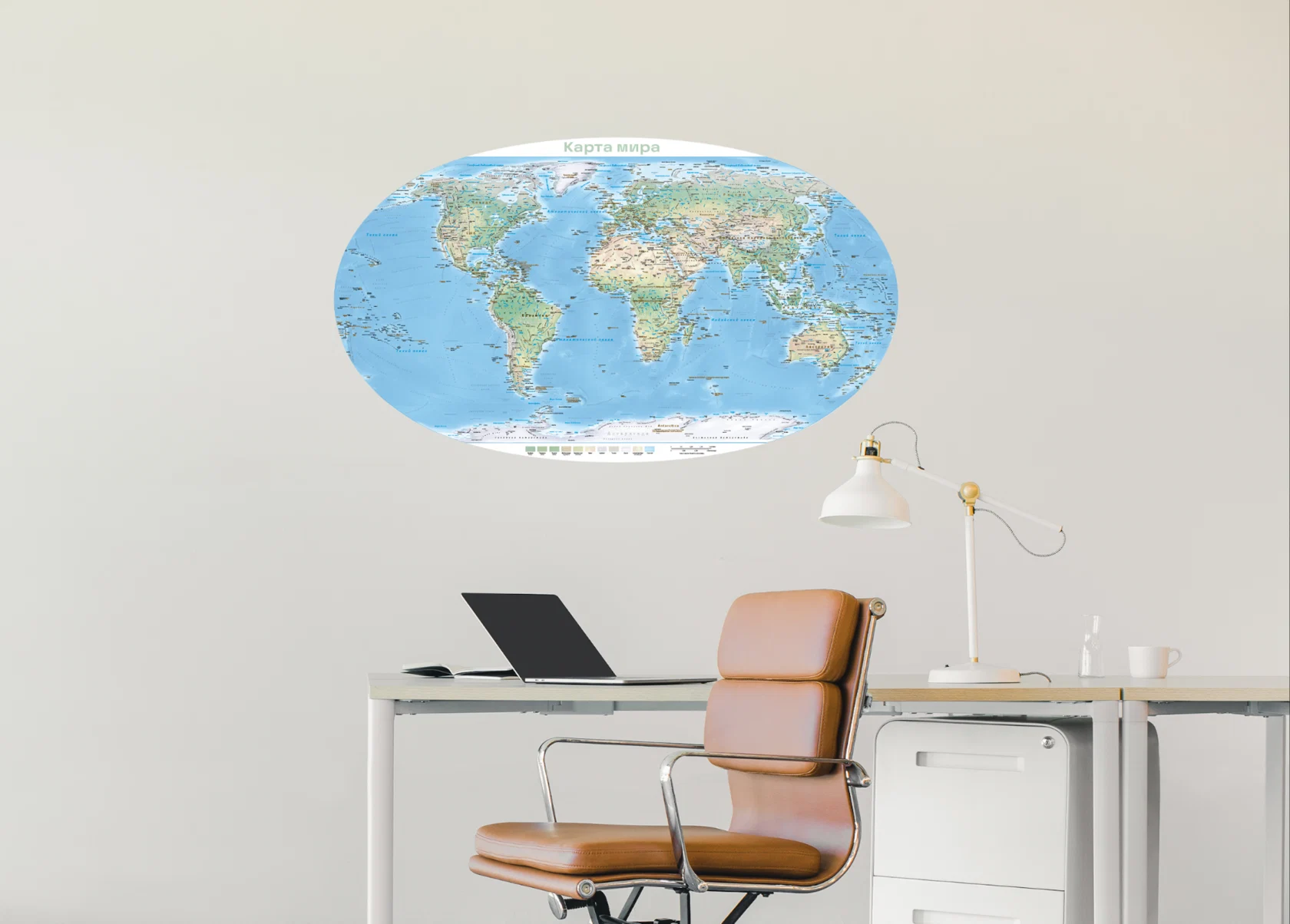
It looks impressive, yet the poles are left without space (unless they are shown as separate circles), and with print-on-demand no one is going to trim maps to such a complex outline.
So we have decided to keep to the rectangle, use only two corners for the insets, and raise the main map slightly.
So we have decided to keep to the rectangle, use only two corners for the insets, and raise the main map slightly.
Ekaterina Shchekina
painter
I adore maps.
Especially the kind with whales, palm trees, castles — or at the very least, Mordor with a hobbit trail. So when I was invited to draw one, I gladly said yes.
Only later did I think: “Hmm. But how exactly..?”
Especially the kind with whales, palm trees, castles — or at the very least, Mordor with a hobbit trail. So when I was invited to draw one, I gladly said yes.
Only later did I think: “Hmm. But how exactly..?”
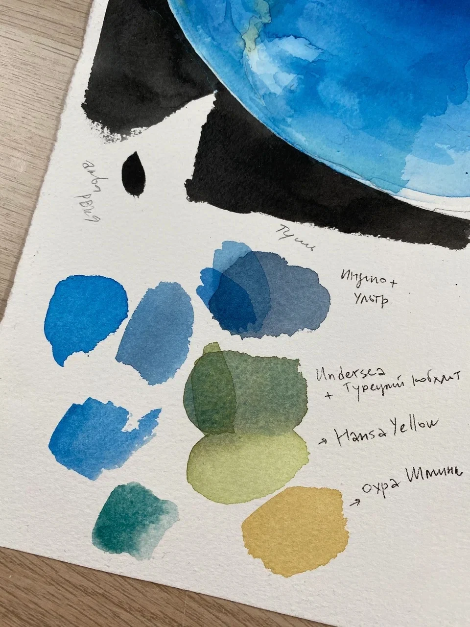
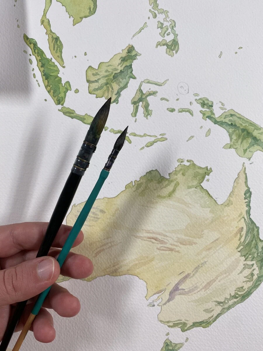
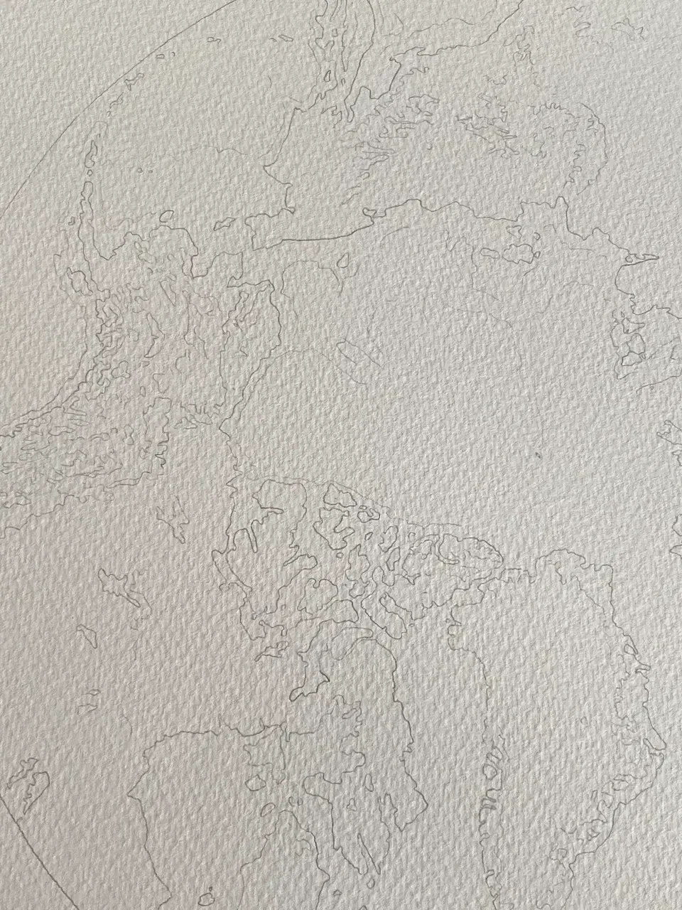
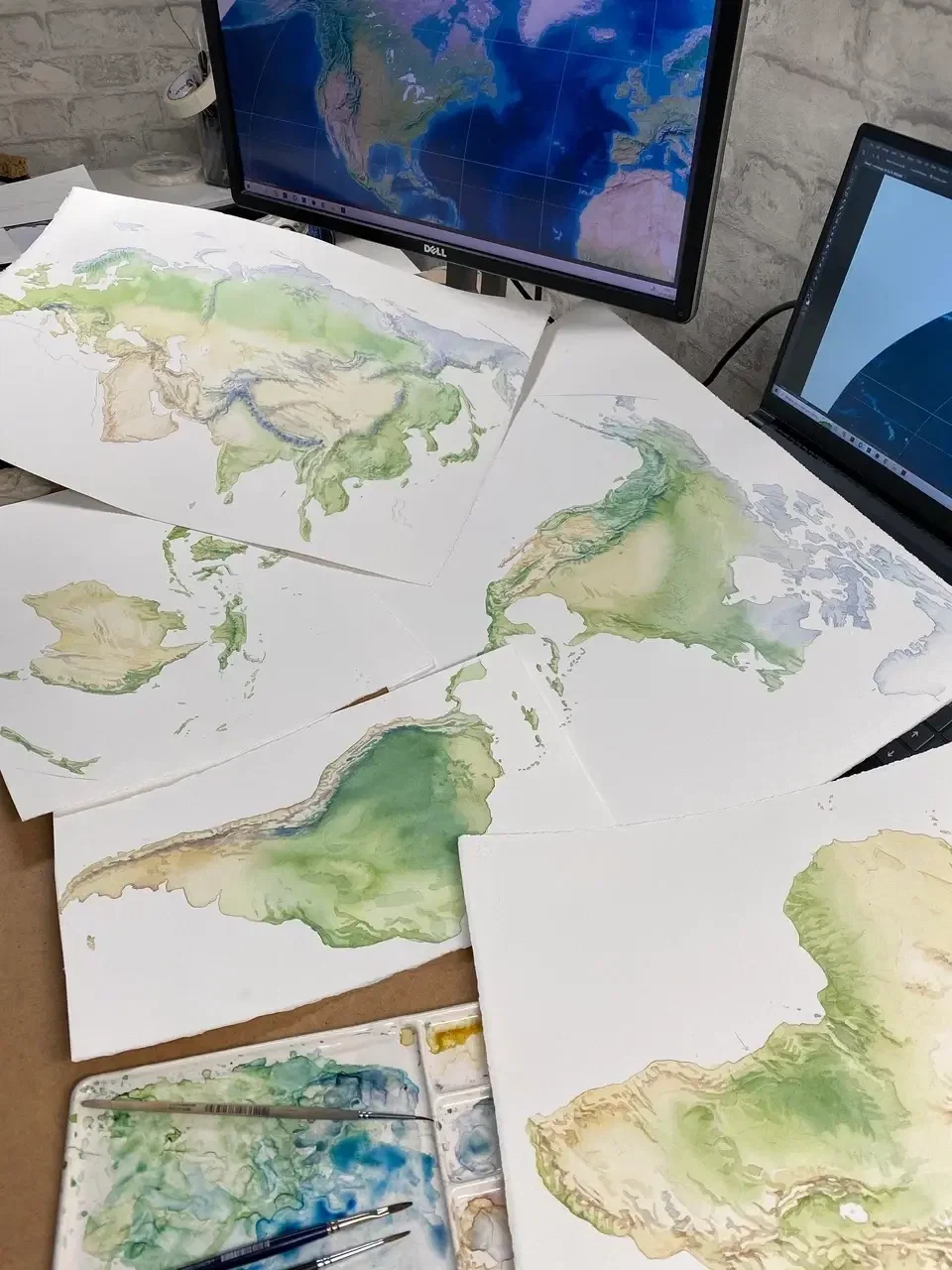
In theory, it all sounded simple — divide it into continents and oceans. In practice, that’s when the fun began. I tested colours digitally, then on paper. Labelled pigments, tried out little swatches. I trusted the paper straight away — my favourite British cotton. Everything else was up in the air. Truly — everything.
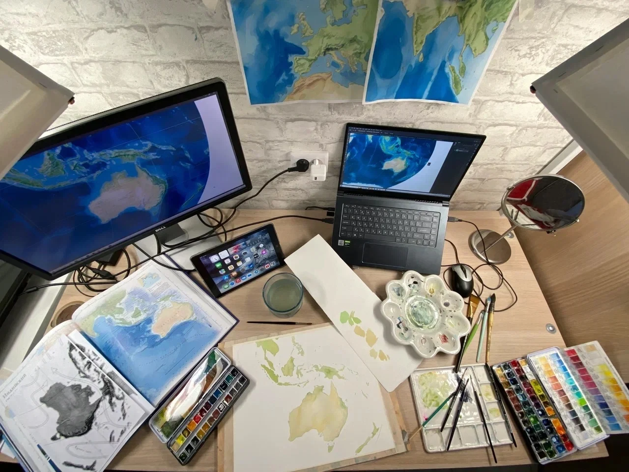
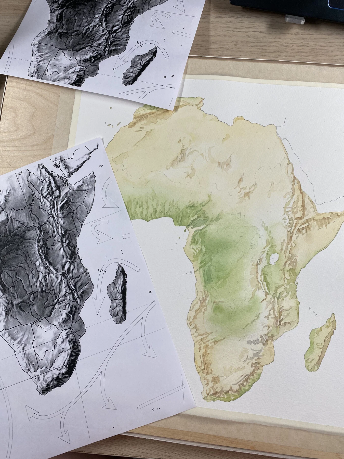
I painted the continents one by one, and each took on a life of its own.
Australia — neat, compact, cooperative.
Africa — a guessing game of mountain ranges.
The Americas — I started with the mountains, because guessing got old fast.
Eurasia — “Can I just redo the whole thing?..”
Greenland and Antarctica — a bonus round: pure watercolour bliss.
Australia — neat, compact, cooperative.
Africa — a guessing game of mountain ranges.
The Americas — I started with the mountains, because guessing got old fast.
Eurasia — “Can I just redo the whole thing?..”
Greenland and Antarctica — a bonus round: pure watercolour bliss.
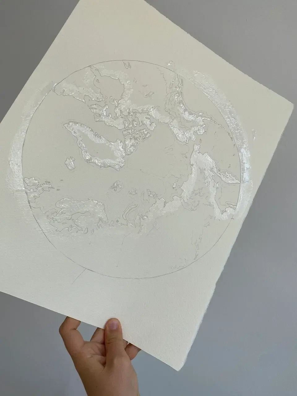
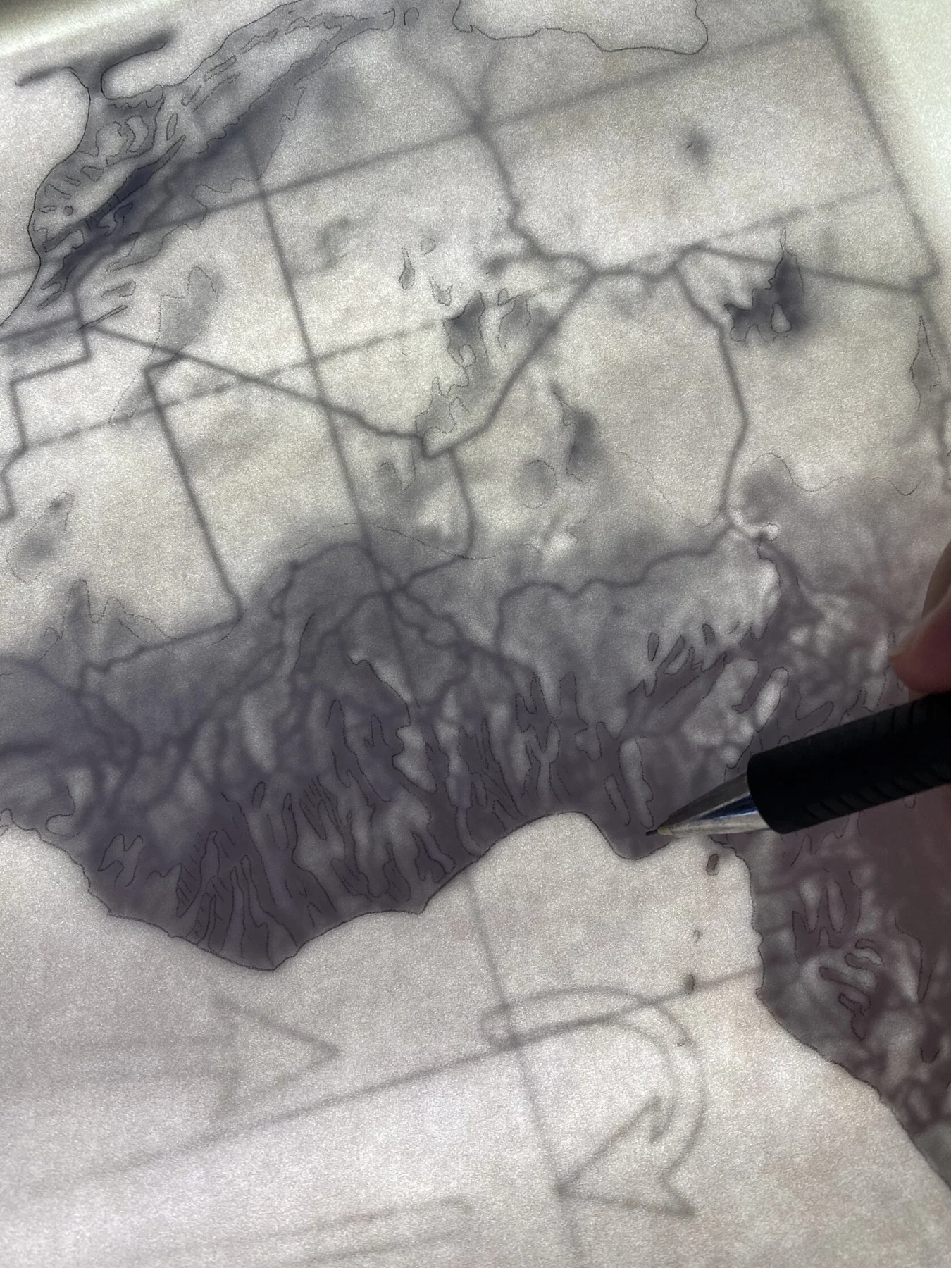
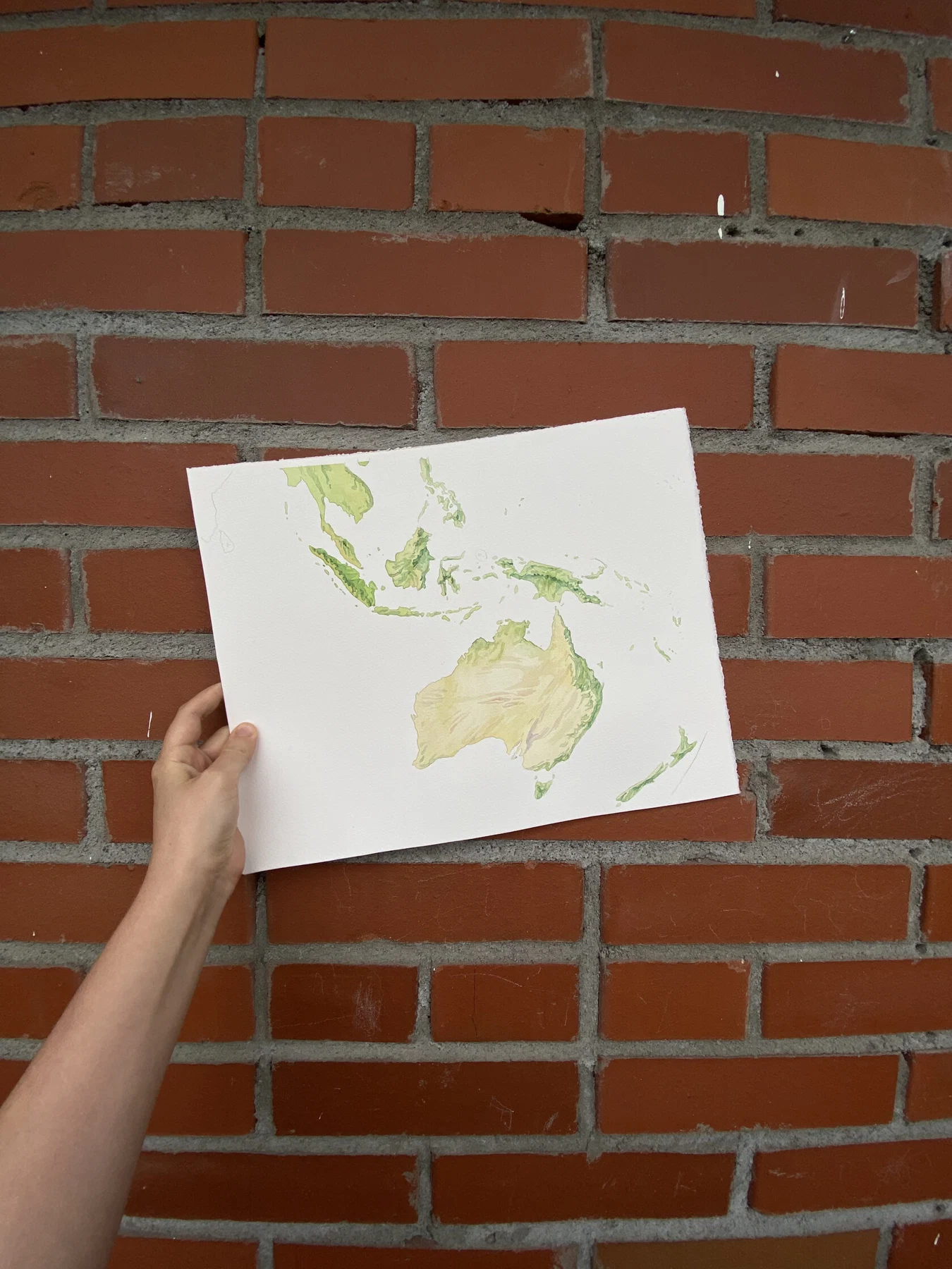
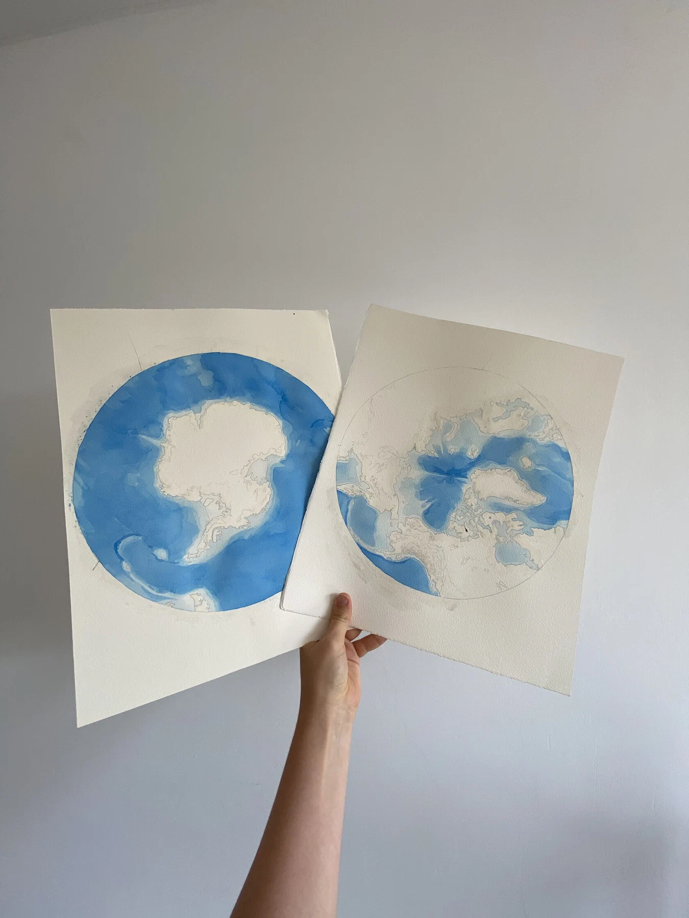
The oceans were a separate quest: the scale was all wrong, but I wasn’t about to give up.
I painted the entire sea on a full watercolour sheet — gradients, washes, a bit of magic — all with overlapping sections, so that it could be stitched back together without tears!
I painted the entire sea on a full watercolour sheet — gradients, washes, a bit of magic — all with overlapping sections, so that it could be stitched back together without tears!
I scanned it all at home, piece by piece. Assembled it in Photoshop like a carefully restored jigsaw puzzle. Some bits I polished up, others I left with their handmade textures. Nepal needed rescuing — the format just didn’t allow for tiny details. Africa, though — I’m still a little in love.
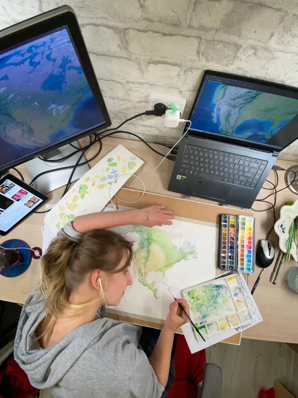
It was a big, occasionally bewildering, but thoroughly delightful project. I’d do it completely differently now. But I say that about every project.
Then a year later, I look back and think:
“Blimey. Did I really draw that?..”
Then a year later, I look back and think:
“Blimey. Did I really draw that?..”
Nikita Slavin
cartographer
We then dove into the long, patient process of developing our map’s visual language — what the base layer would look like, which features to include and how to show them, and which symbols and fonts to use.
Once the watercolour base was finalized, the fonts chosen, and the projection and sheet size set — the map finally began to feel real. That was the first moment it felt like magic: delicate vector layers and labels breathing life into the painted surface. The map was alive!
A few more iterations followed — or rather, a year and a half of life, two house moves, and a lot going on both inside and out. Then, the first full print (still on white background) was on my desk in Helsinki.
A few more iterations followed — or rather, a year and a half of life, two house moves, and a lot going on both inside and out. Then, the first full print (still on white background) was on my desk in Helsinki.
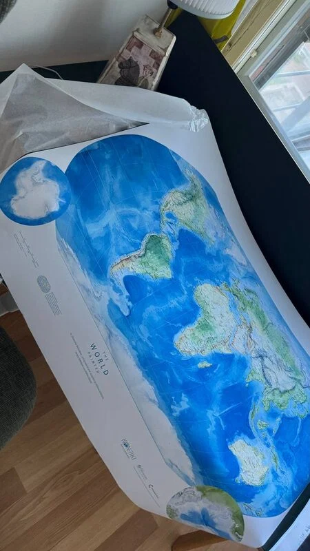
That’s when Milana joined the project — picking up the cartographic side: label placements, font curation, data checks, improving the symbology
Only when returning to the very beginning of work on our grand map did I realise that, in the meantime, I had already changed jobs twice and that my patience and perseverance had been challenged countless times.
My respect has grown manifold for old-school cartographers who placed labels on maps entirely by hand — those maps we regard as benchmarks of quality, such as NatGeo or the old German atlases.
My respect has grown manifold for old-school cartographers who placed labels on maps entirely by hand — those maps we regard as benchmarks of quality, such as NatGeo or the old German atlases.
Milana Glebova
cartographer
There are cartographers (and designers) who are able to devise systems in advance and follow them faithfully. And then there are those who invent everything on the fly, through practice — and I am definitely one of the latter.
Although my very first task was meant to be developing labelling styles and then applying them, in reality I began at the end: I invented styles intuitively, as I went along, and only afterwards made adjustments to gather my ideas into some sort of system.
Still, I lacked the focus to work on labels alone in a steady sequence, so I found myself darting from South America to Africa, and halfway through fleeing to Australia instead.
I can no longer retrace the entire sequence, so I will briefly comment on a few of the decisions made for individual layers.
Although my very first task was meant to be developing labelling styles and then applying them, in reality I began at the end: I invented styles intuitively, as I went along, and only afterwards made adjustments to gather my ideas into some sort of system.
Still, I lacked the focus to work on labels alone in a steady sequence, so I found myself darting from South America to Africa, and halfway through fleeing to Australia instead.
I can no longer retrace the entire sequence, so I will briefly comment on a few of the decisions made for individual layers.
The first thing I felt compelled to do was to overhaul the hydrography labels. In the draft version, everything was set in Frutiger — an excellent typeface, yet the sinuous river labels tended to fall apart in it, evoking the look of cheap mass-market contour maps. After much debate, weighing both objective and subjective qualities, we settled on Bitter as the most fitting choice for our watercolour hydrography.
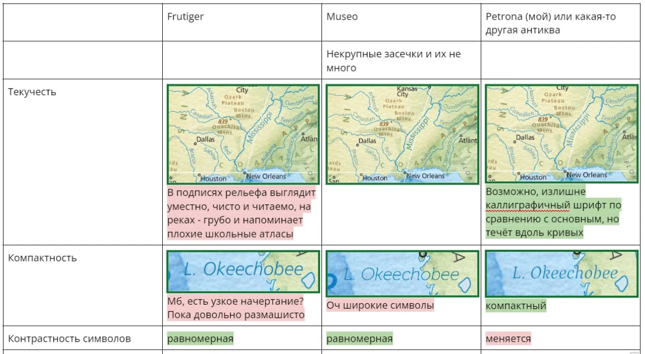
I don’t particularly enjoy starting the design of a map with choosing typefaces; it always feels slightly painful. Compromise is especially crucial in cartography: a clean, highly legible font often ends up having no personality, while a striking and characterful one is usually too flamboyant and difficult to read.
The cities layer turned out to be an unexpectedly long story. It required updating outdated names and bringing them into a consistent standard (English usage versus local forms).
It was clear that some kind of hierarchy was needed, so I decided to group the settlements into several cohorts by population, and to encode the type of place — capital city, town, village, research station, and so on — then convey this subtly through typeface choices and distinctive icons.
It was clear that some kind of hierarchy was needed, so I decided to group the settlements into several cohorts by population, and to encode the type of place — capital city, town, village, research station, and so on — then convey this subtly through typeface choices and distinctive icons.
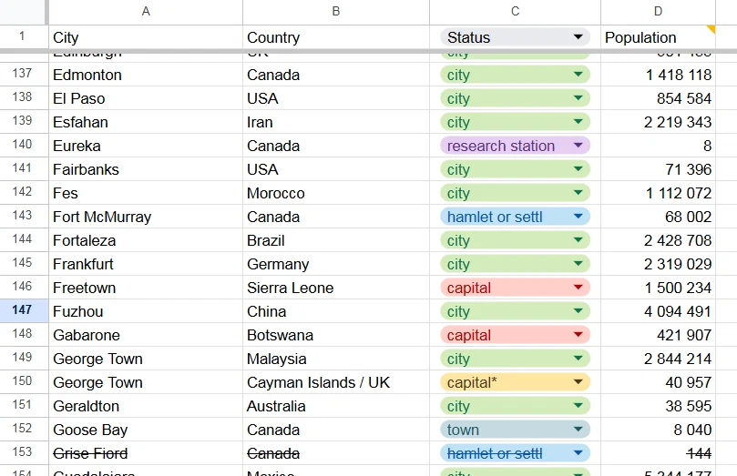
On a physical map, relief plays one of the leading roles, and I wanted to preserve that importance without letting it overshadow the beautiful base layer or compete with it. I therefore chose to label the relief in confident bold type, but blend the labels into the terrain. I picked smoky shades that harmonise with the basemap and feel intuitively connected to the nature of the features: mountains in rocky dark tones, lowlands in grassy greens, steppes in straw-like yellows, and so on. Still, no rule should be followed merely for the sake of it, so all labels fade away in Antarctica.
The labels for high mountains (in the original — of dismal quality, both in their figures and in the selection) brought back memories of my early geography courses, nomenclature lists, and the basic principles of generalisation. I subjectively selected the highest peaks of individual ranges and massifs already shown on the map, as well as other prominent and well-known summits, guided by lists such as “highest mountains of Africa/Eurasia…”, other overview maps, travellers’ guidebooks, and plain common sense.
The labels for high mountains (in the original — of dismal quality, both in their figures and in the selection) brought back memories of my early geography courses, nomenclature lists, and the basic principles of generalisation. I subjectively selected the highest peaks of individual ranges and massifs already shown on the map, as well as other prominent and well-known summits, guided by lists such as “highest mountains of Africa/Eurasia…”, other overview maps, travellers’ guidebooks, and plain common sense.
In contrast with the literally tangible forms of relief, islands and peninsulas are little more than conventional nicknames for pieces of land. That is why they are given in a light, fine typeface.
The most difficult part for me was the oceanic relief: I don’t know it offhand in the same way I do the landforms; it is less legible against the base and demanded more simplification. I tried to keep the labelling styles in harmony with those on land, to label primarily those features that could be read against the watercolour background, and to retain only the more or less familiar toponyms that would actually mean something to the reader.
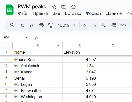
One separate issue was generalisation. The source of the labels betrayed its origin through an uneven density of information: in the United States even selected national parks were labelled, in Canada practically every sizeable lake and some villages with populations of around 87 people, while Siberia, Amazonia, and much of Africa stood out in their emptiness. I tried to even out the density of labels as much as possible, to avoid pointer arrows, and to label only those features that are visible at the given scale and actually drawn in the base layer.
Without any particular heuristic, I kept some historical regional names. Simply because I wanted to, and because “Transvaal” says more to a reader than, say, the Drakensberg.
In short, my contribution turned out to involve a great deal of invisible geographical research and fact-checking, in addition to the straightforward task of placing labels.
The most difficult part for me was the oceanic relief: I don’t know it offhand in the same way I do the landforms; it is less legible against the base and demanded more simplification. I tried to keep the labelling styles in harmony with those on land, to label primarily those features that could be read against the watercolour background, and to retain only the more or less familiar toponyms that would actually mean something to the reader.
One separate issue was generalisation. The source of the labels betrayed its origin through an uneven density of information: in the United States even selected national parks were labelled, in Canada practically every sizeable lake and some villages with populations of around 87 people, while Siberia, Amazonia, and much of Africa stood out in their emptiness. I tried to even out the density of labels as much as possible, to avoid pointer arrows, and to label only those features that are visible at the given scale and actually drawn in the base layer.
Without any particular heuristic, I kept some historical regional names. Simply because I wanted to, and because “Transvaal” says more to a reader than, say, the Drakensberg.
In short, my contribution turned out to involve a great deal of invisible geographical research and fact-checking, in addition to the straightforward task of placing labels.
Sergey Nikolaev
designer
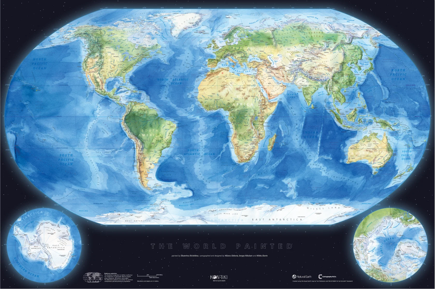
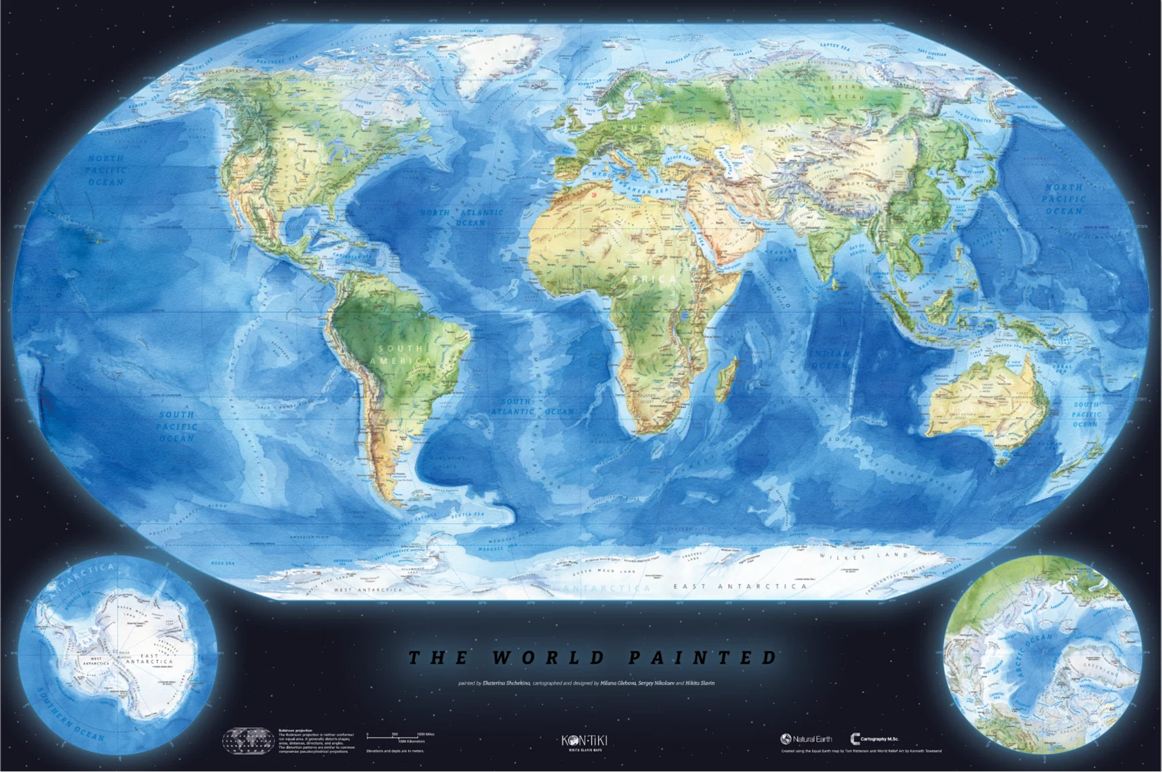
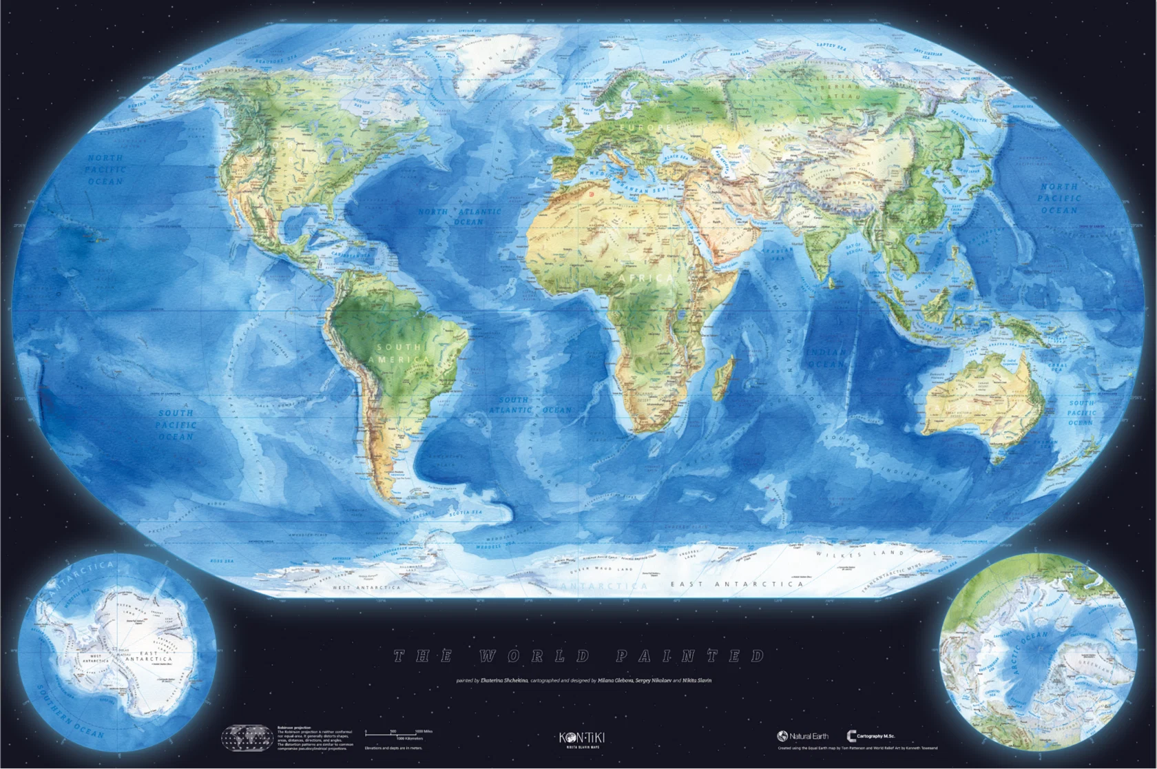
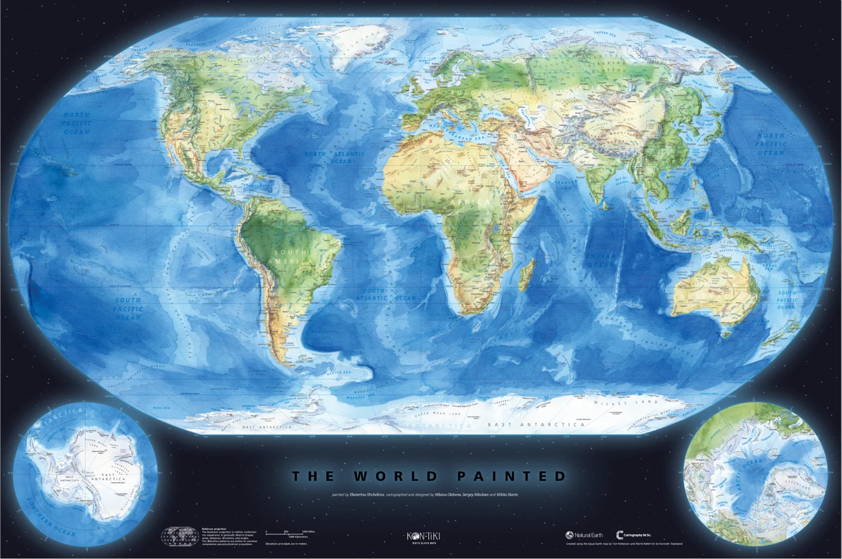
We are adjusting the sizes and refining the placement of the polar insets so that the main map retains plenty of space and the poles do not obscure important areas.
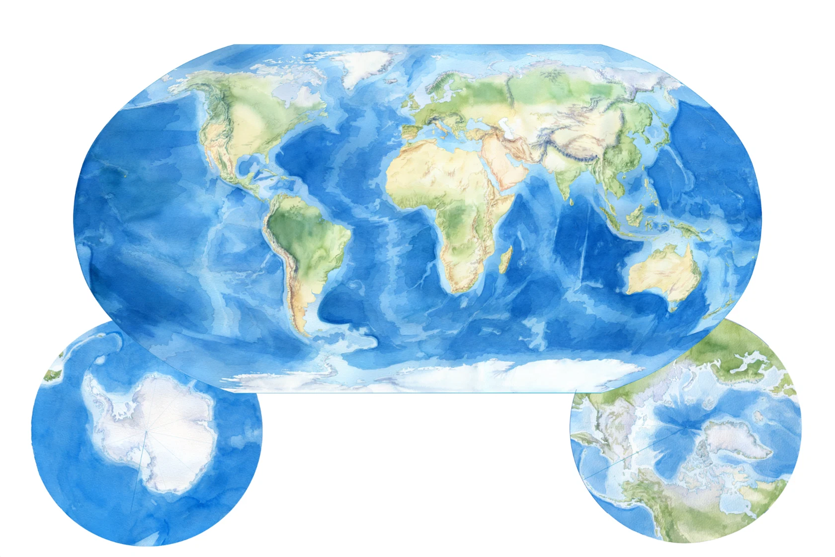
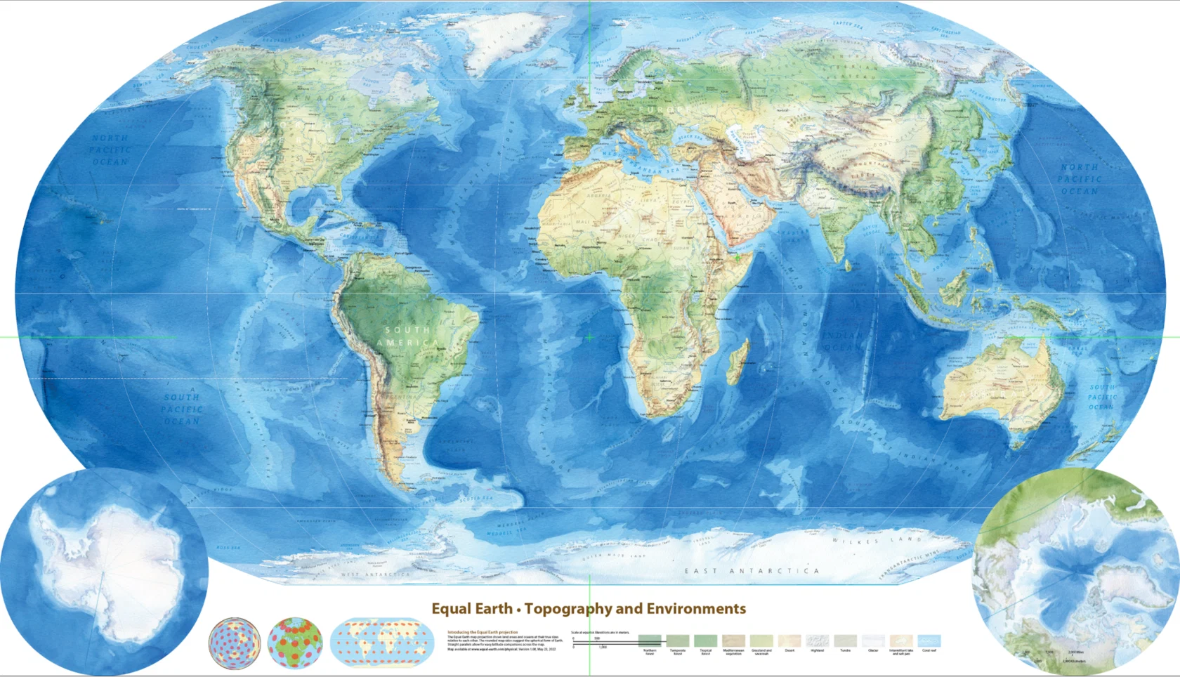
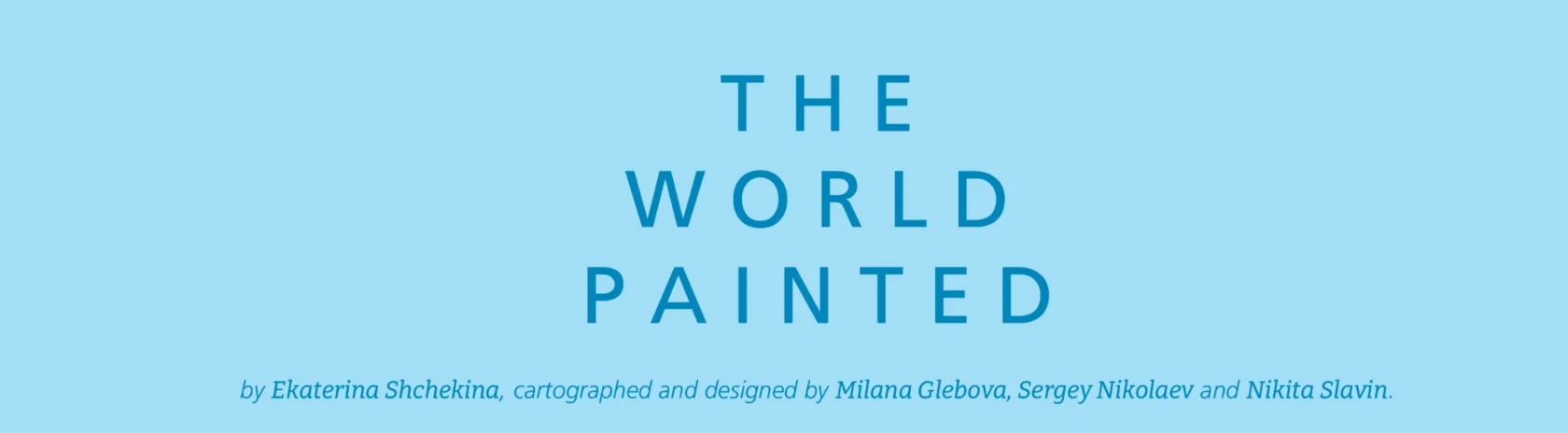
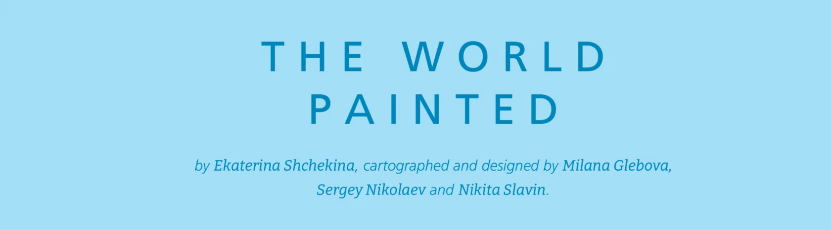
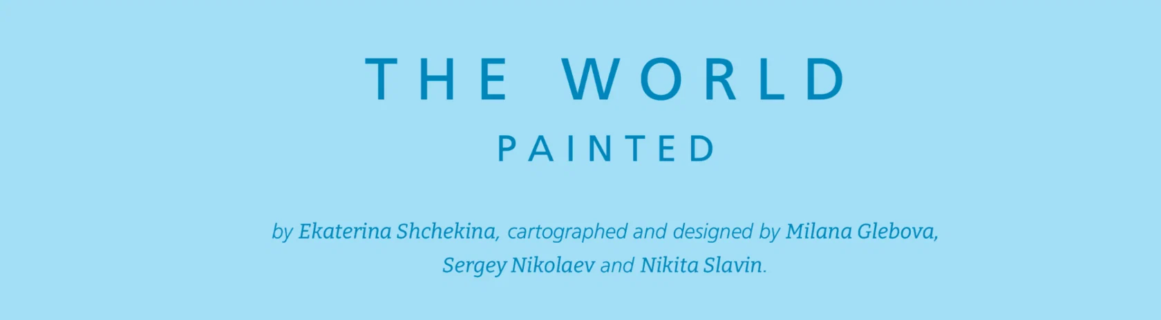
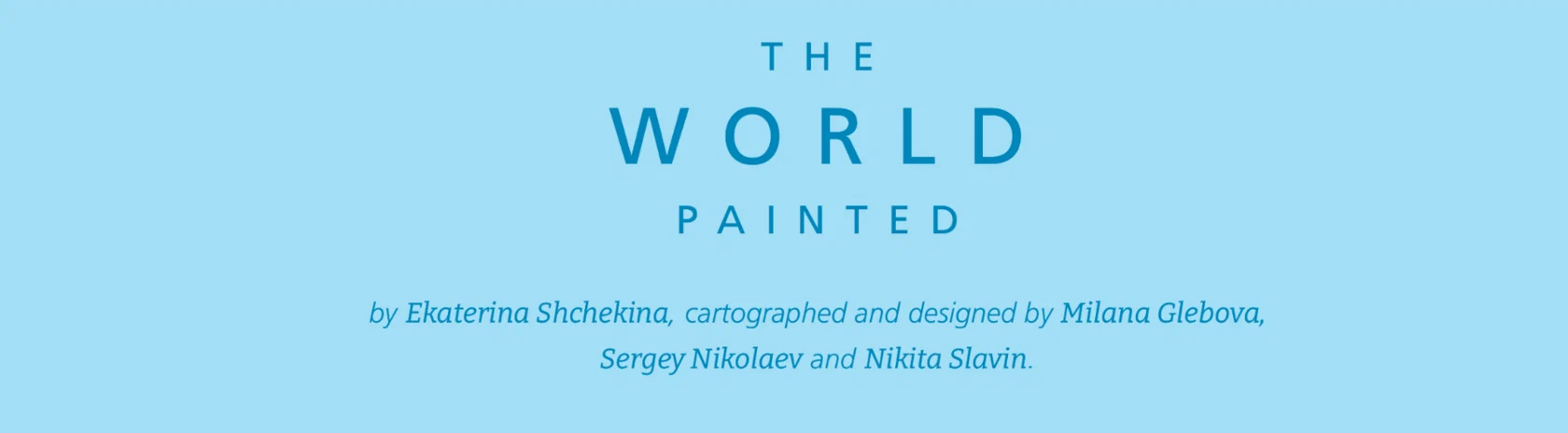
Once it is clear how much space remains between the poles, we fill it with information, starting with the map title.
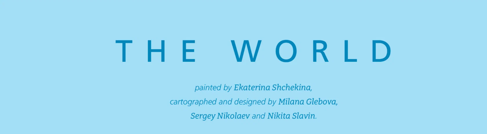
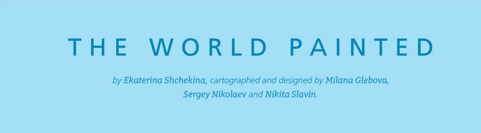

And then comes the most important question — what colour the background will be. We try black, white, and a neutral blue, and virtually test them against both dark and light walls.
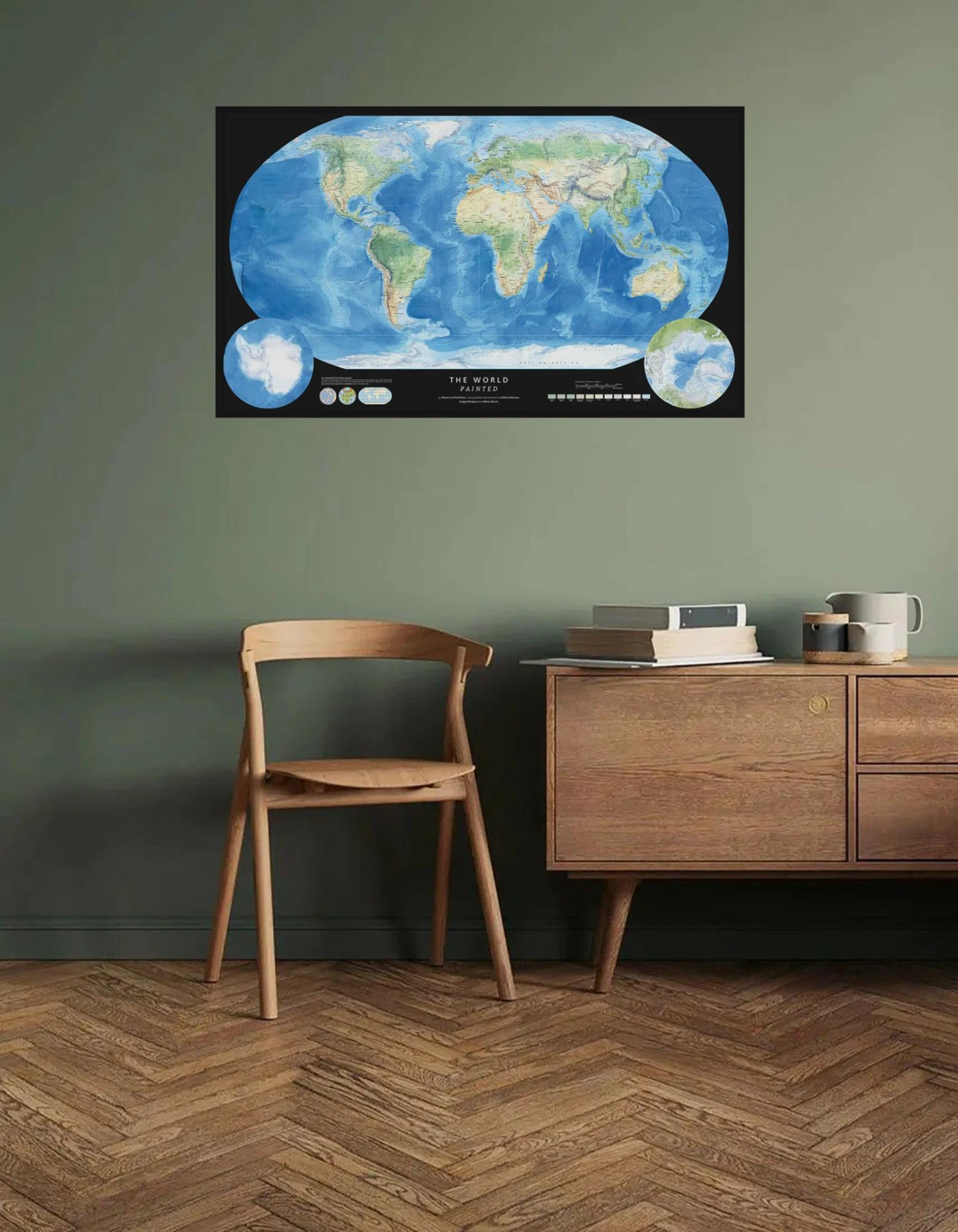
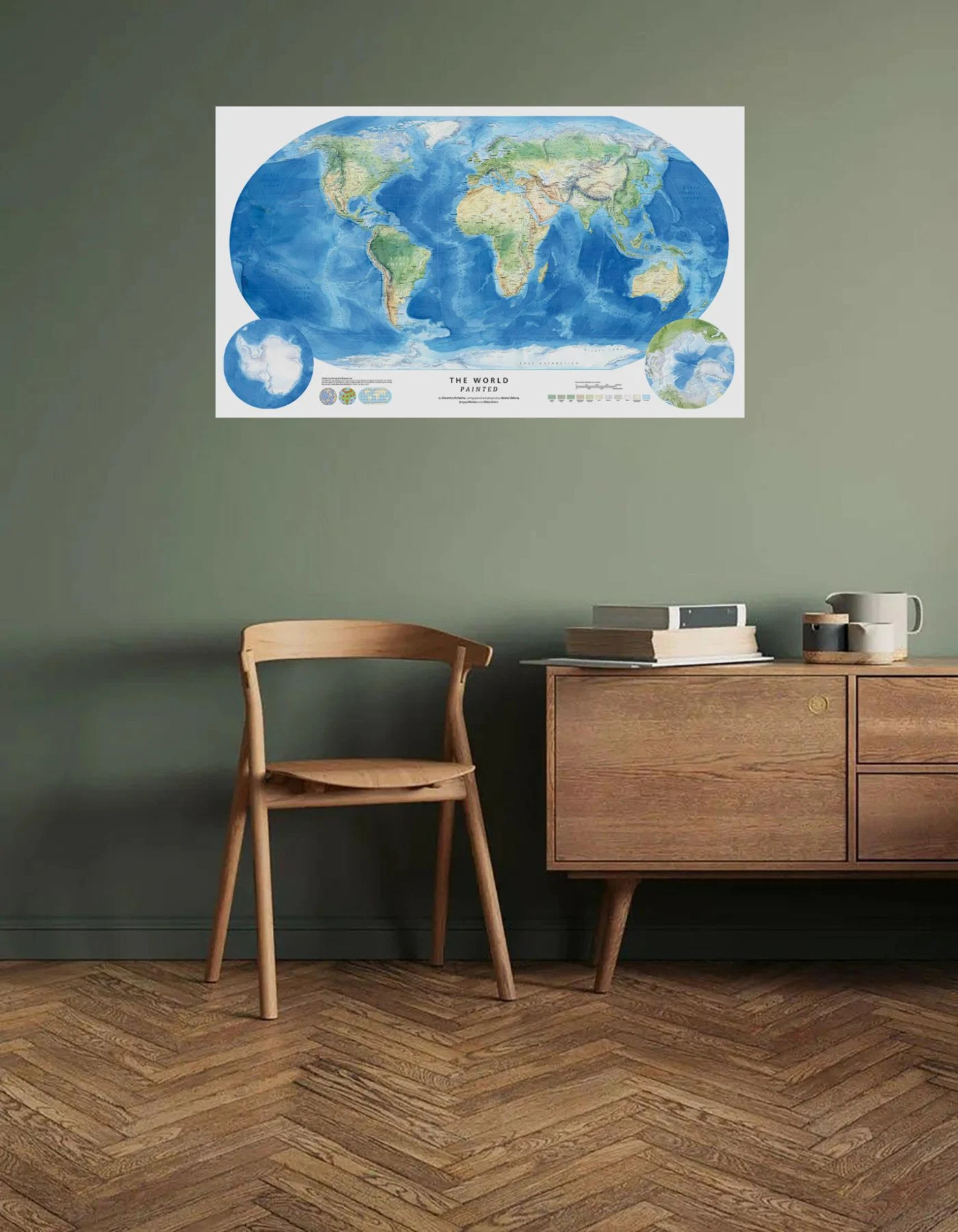
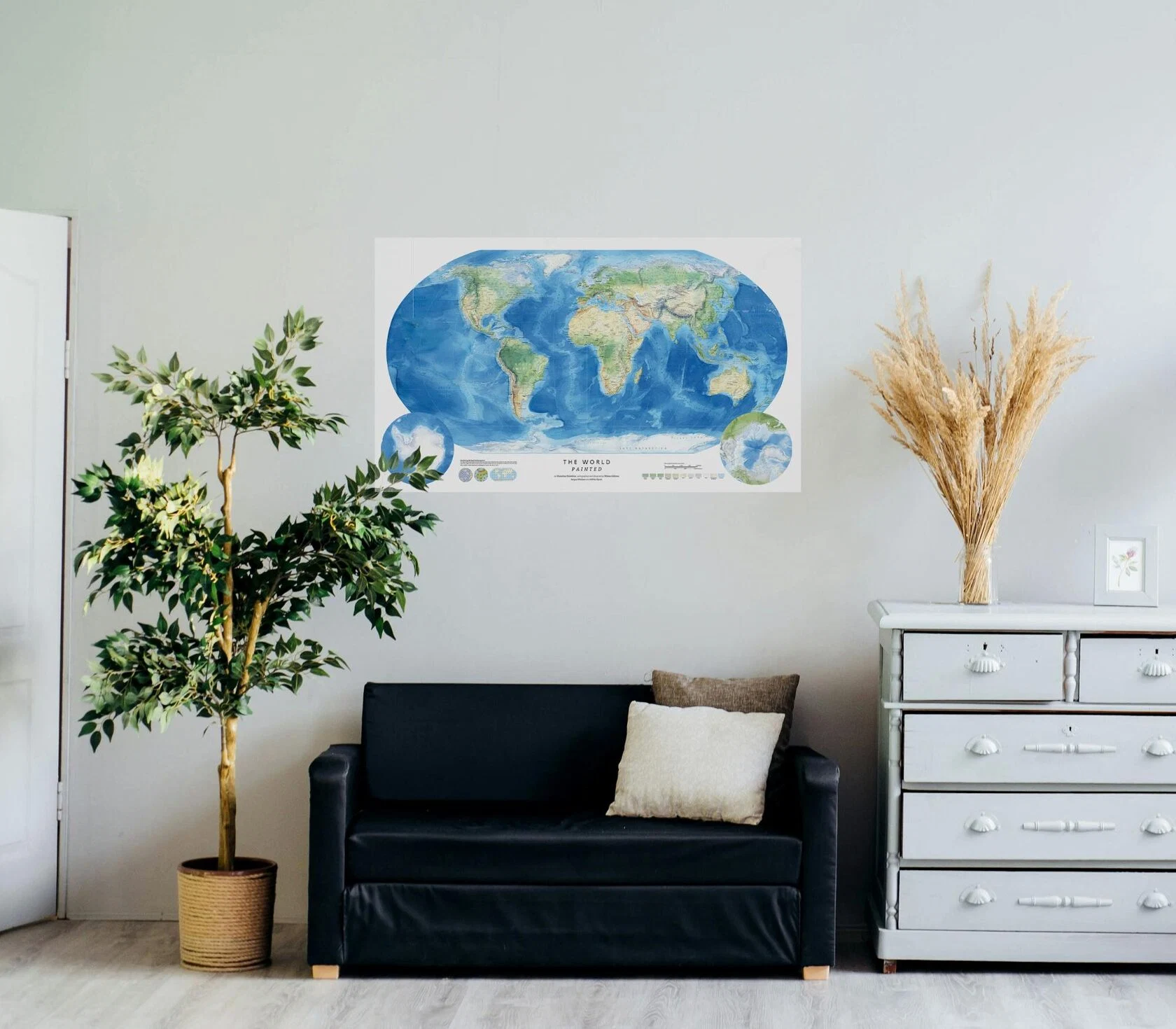
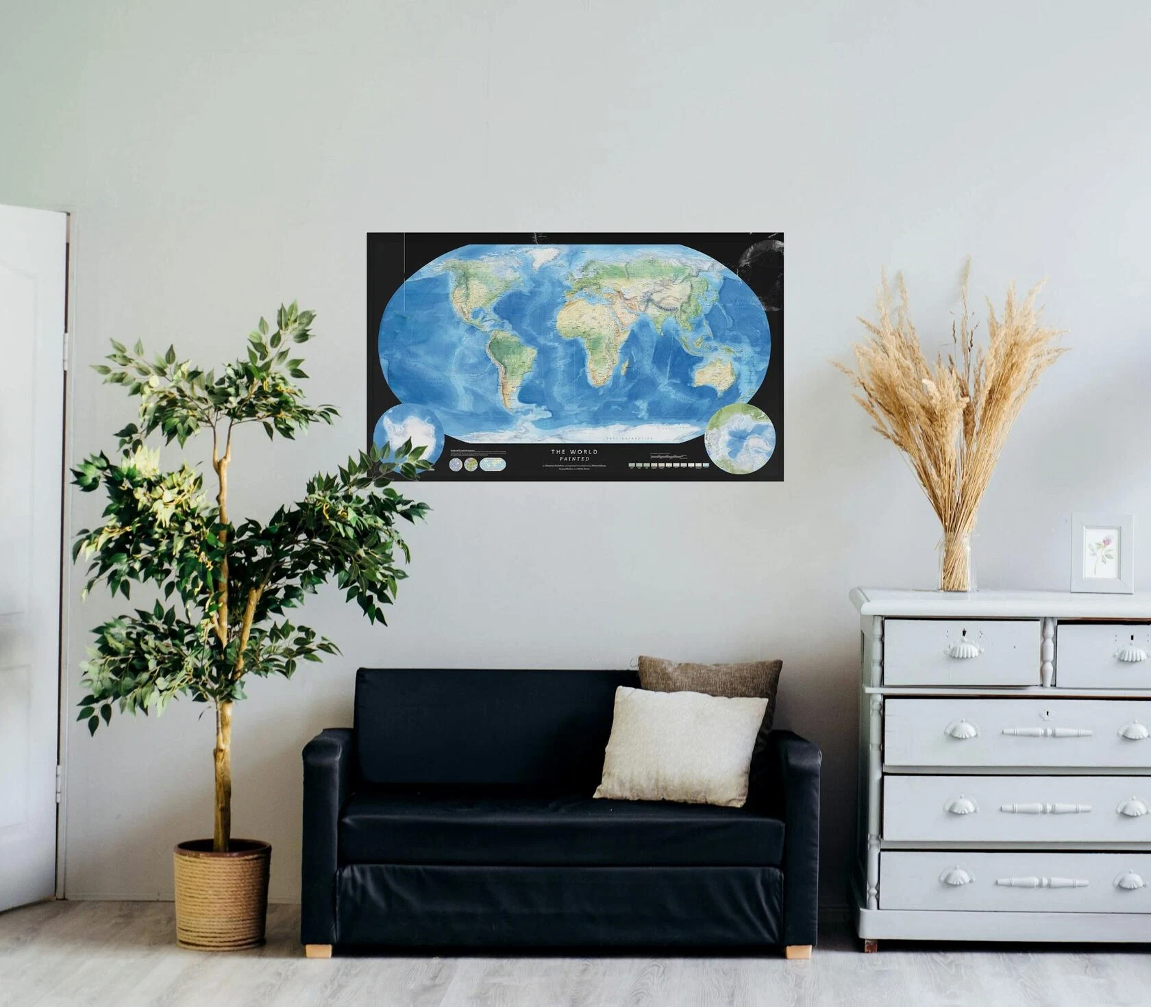
We make printouts to assess them in real life.
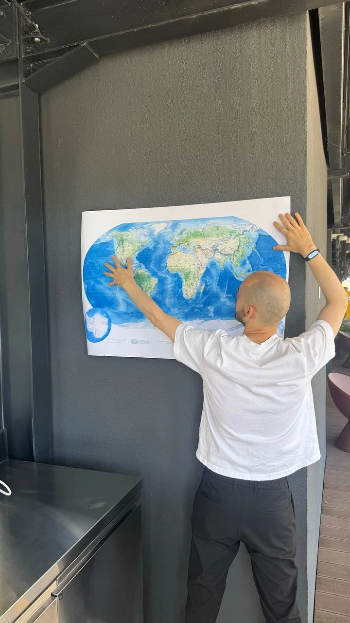
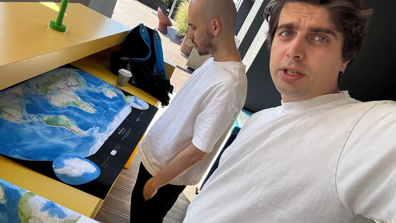
The black background won, but only on the condition that it is not pure black, but slightly grey.
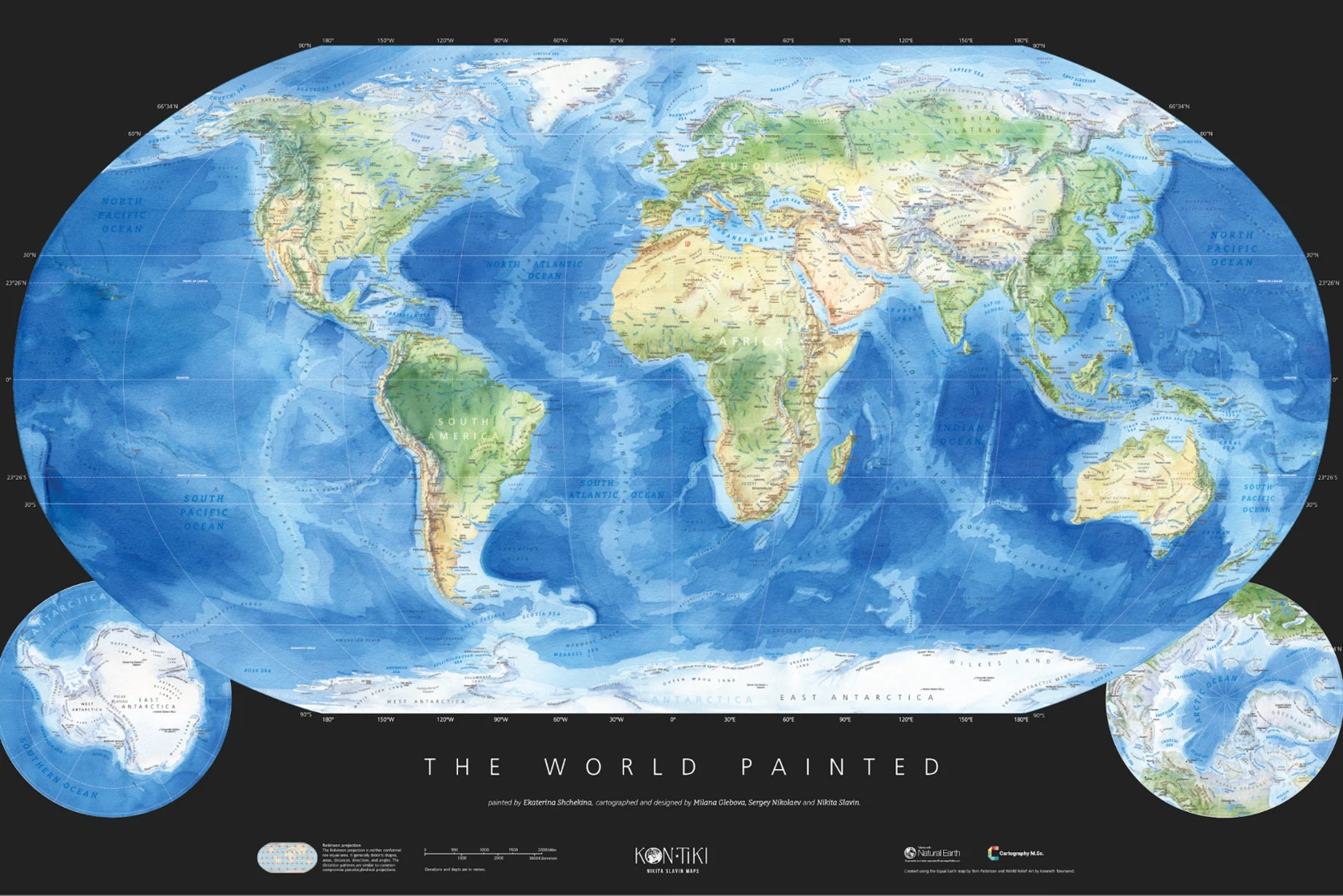
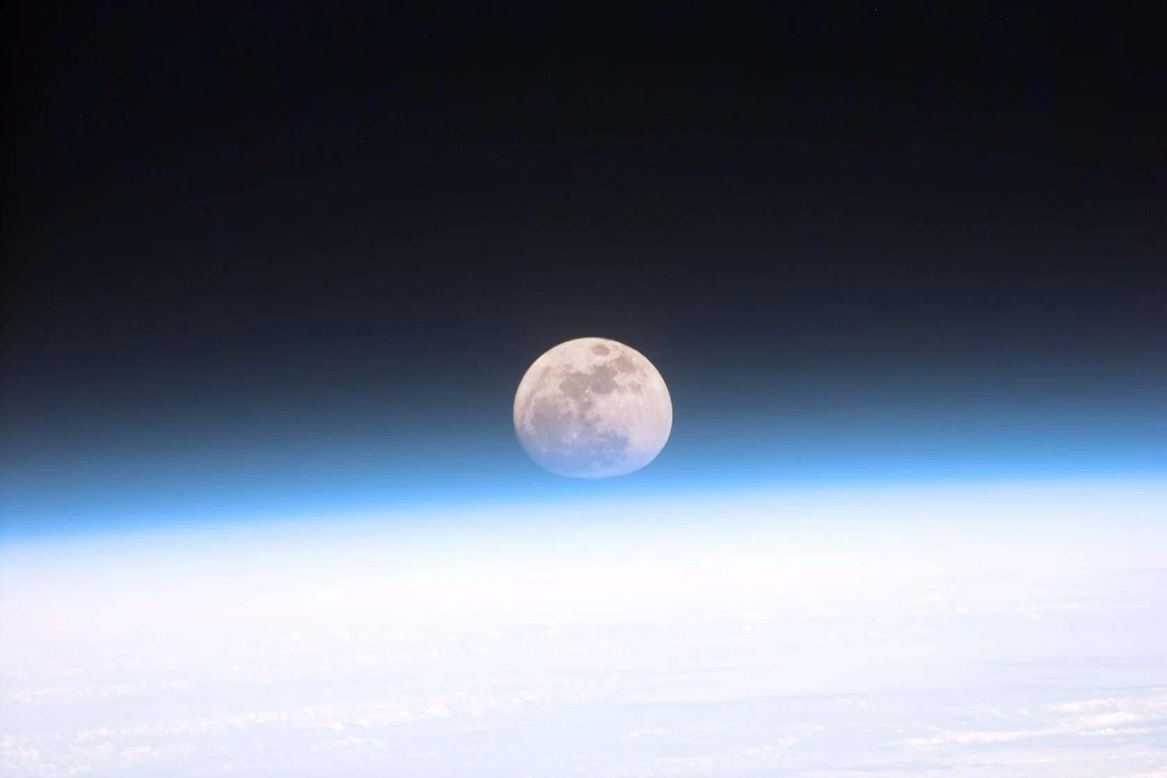
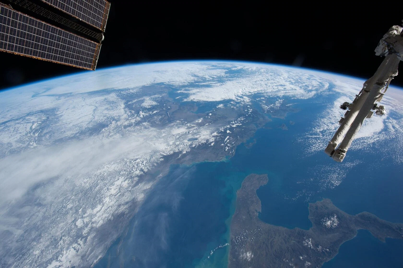
This evolves into the idea of hanging our map in space with stars. We recreate the atmospheric gradient based on photographs from the ISS.
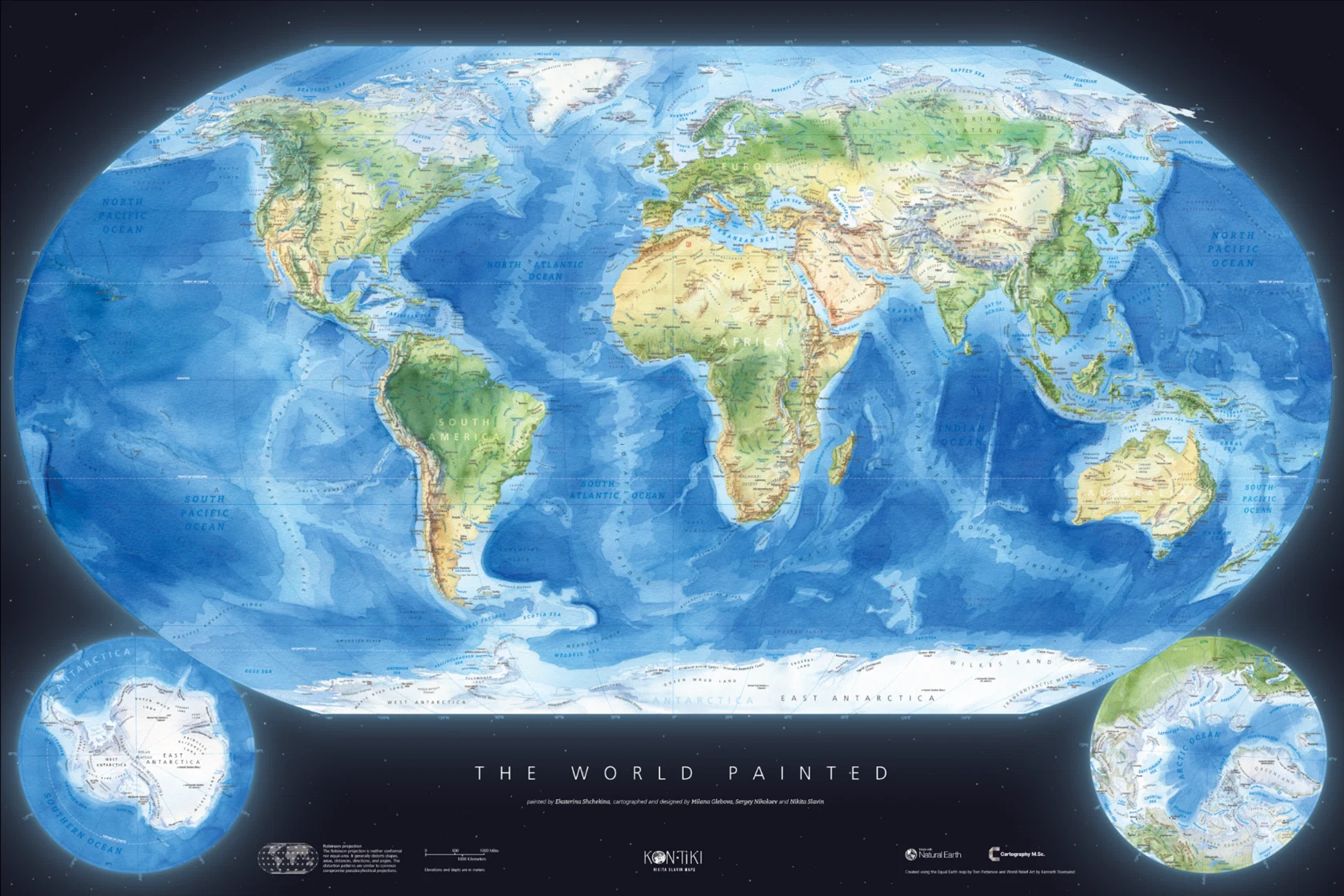
Once again, we go through different title options.
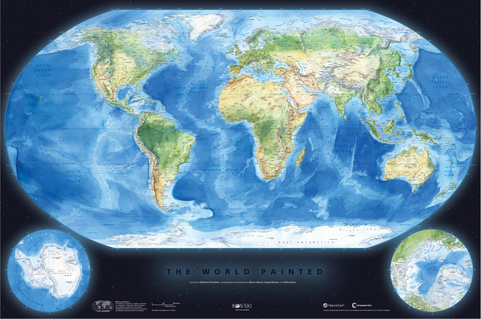
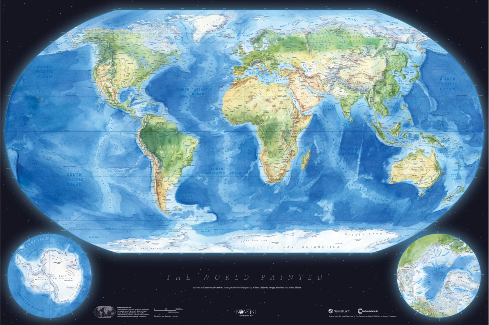
1 / 6
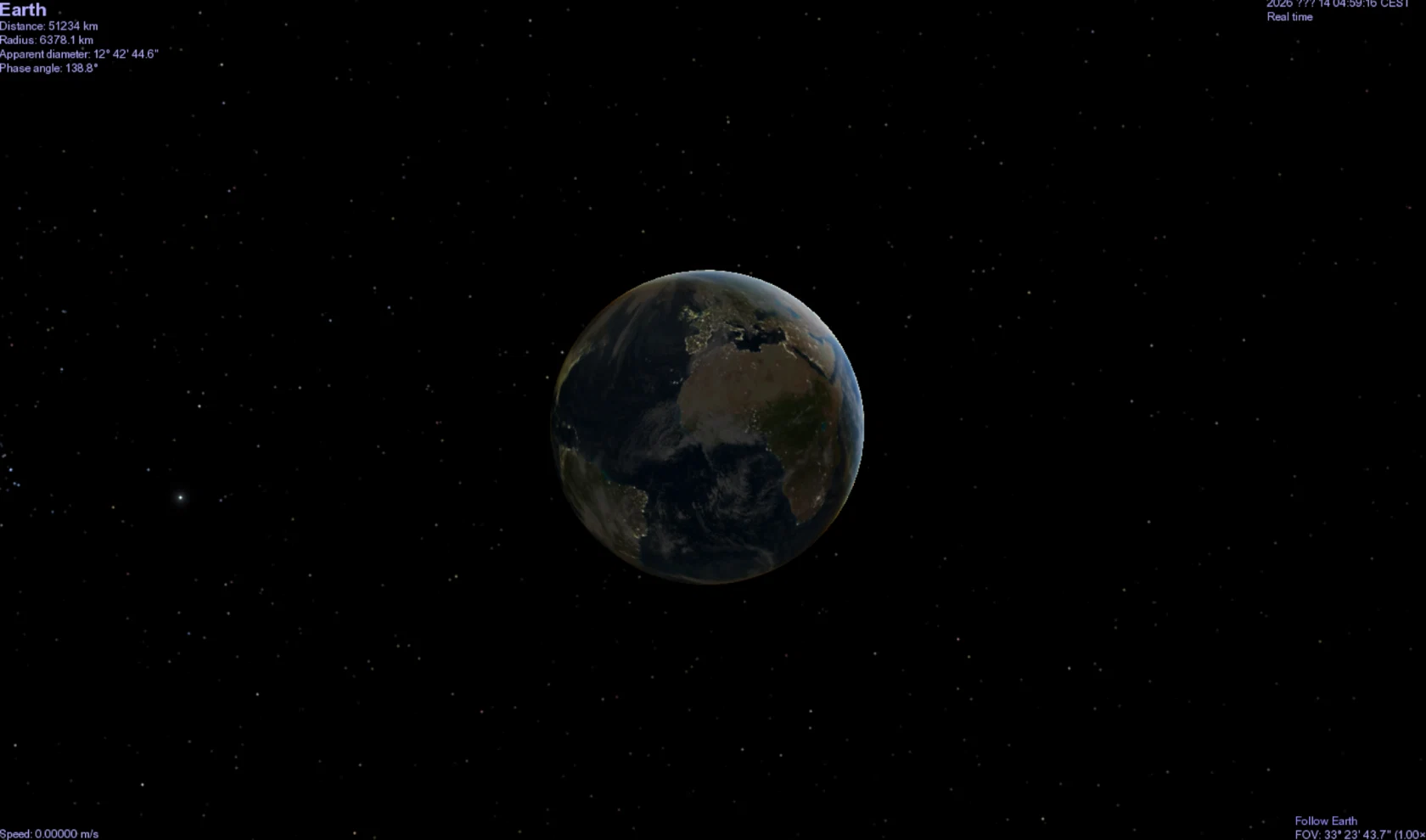
We like the cosmic background, but at the moment it is just randomly scattered dots, whereas we want it to feel like real space. So we look at how the Earth appears from afar.
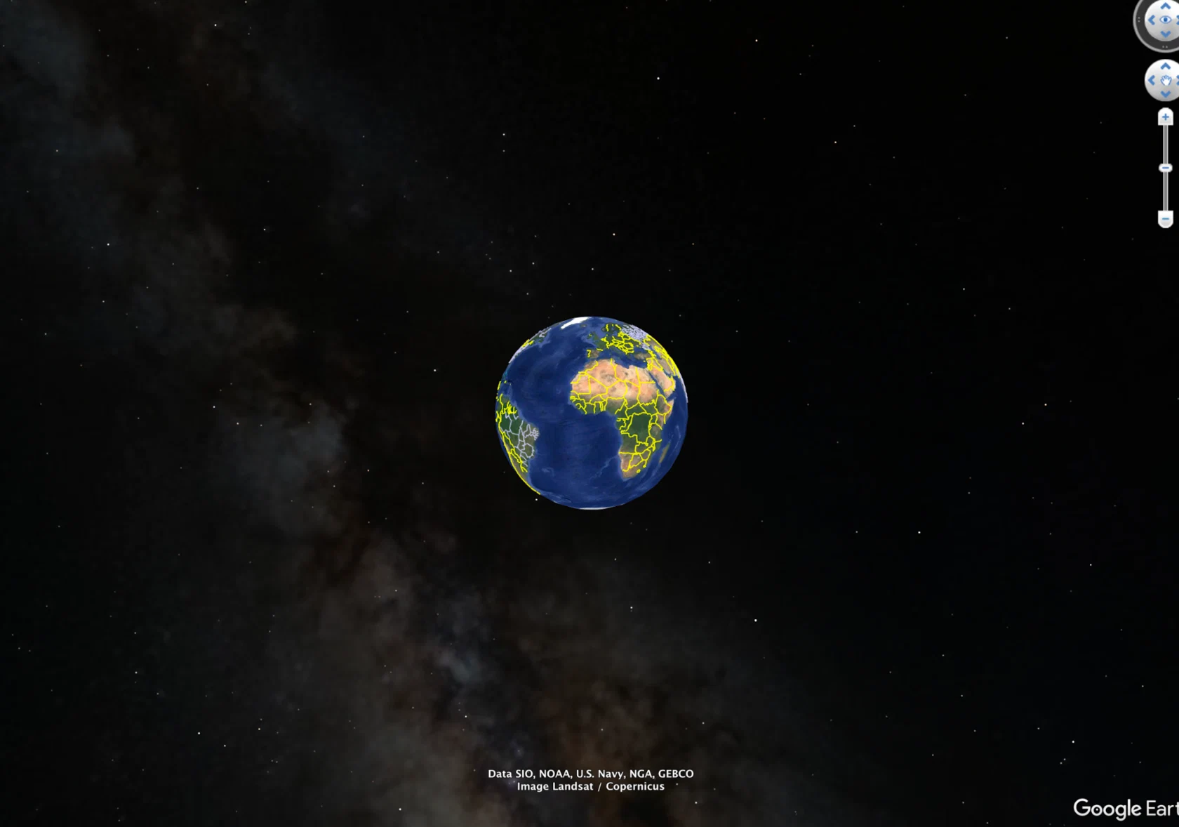
We explore sources that can provide the star layout in vector form.
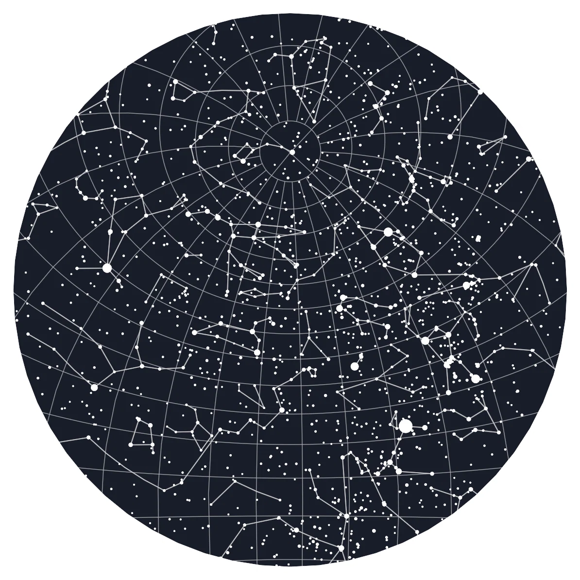
It seems that a starry sky in the Robinson projection would suit the map well, even though it will have to be cropped.
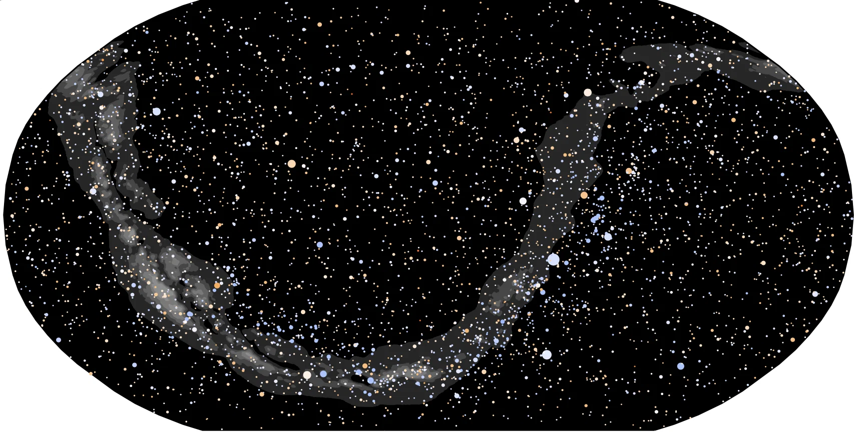
We adjust the sizes and style of the stars.
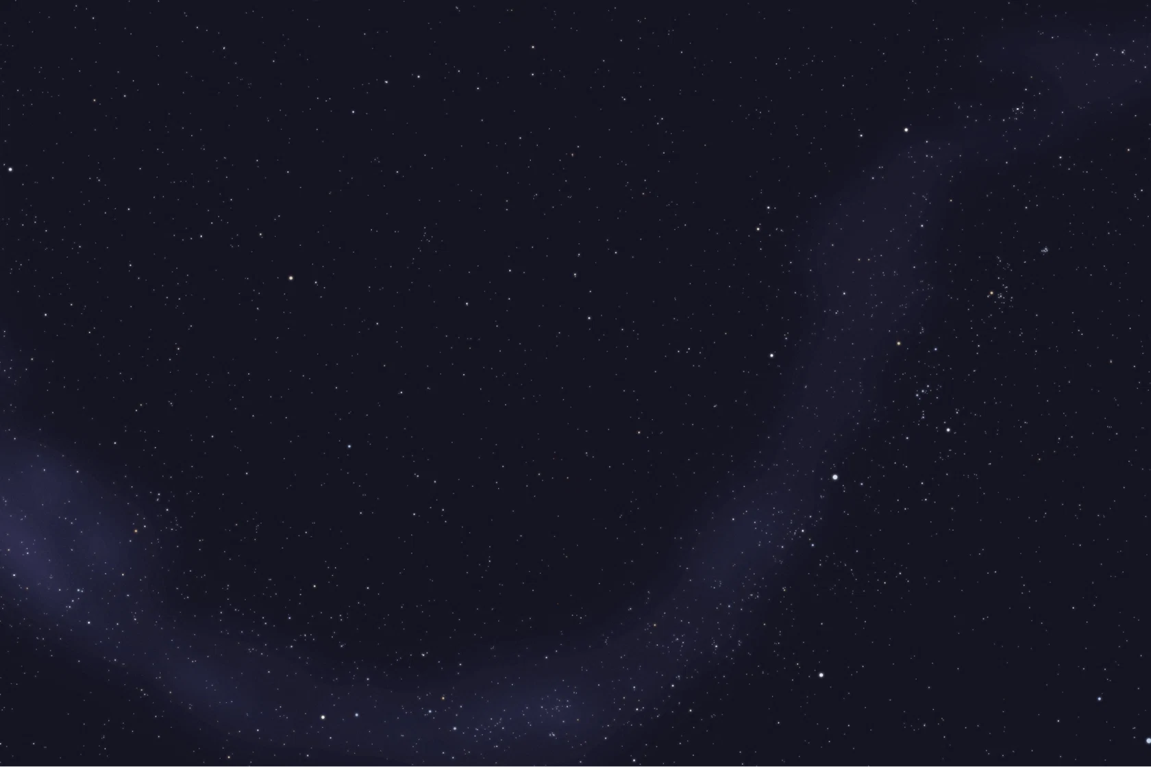
We try it on the map. It looks magnificent, though it needs to be toned down a little.
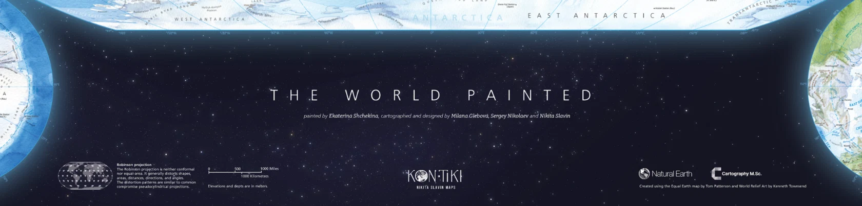
When switching to the dark background, we also changed the graticule from white to blue so that the lines would remain legible even over ice. Now it is time to introduce breaks in the graticule to improve the readability of the labels.
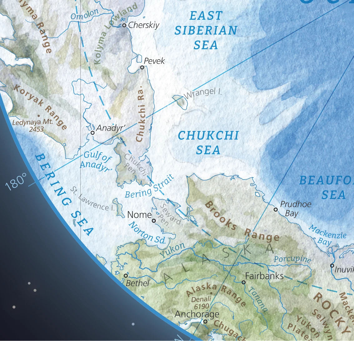
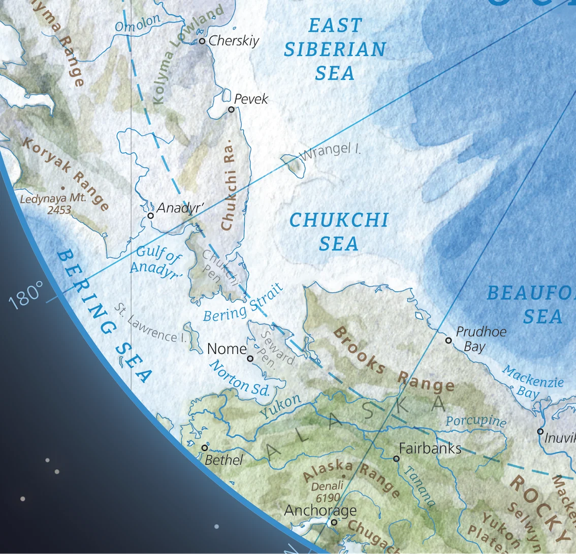
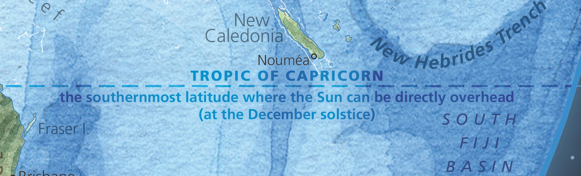
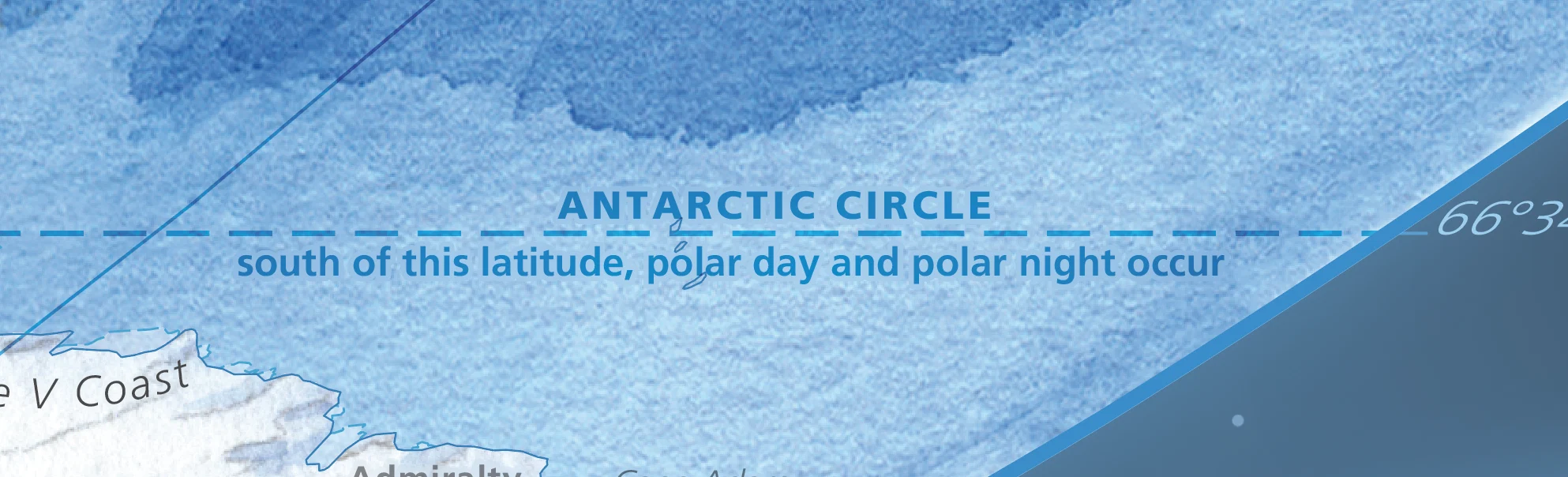
We highlight what makes the polar circles and the tropics noteworthy.
Ekaterina Shchekina
painter
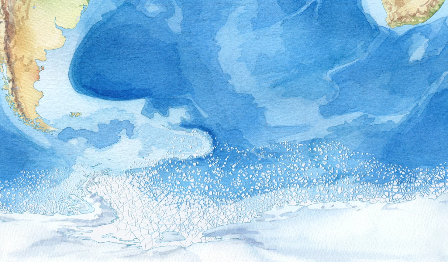
If someone asks me what I was doing in my free time at the start of 2025, I’ll say: chopping ice!
The task appeared when the watercolours were finished and the layout was nearing completion. thought I’d get it done in a few evenings — neat and beautiful.
Nope. I went through every stage: denial, pain, despair, acceptance… sometimes more than once.
The task appeared when the watercolours were finished and the layout was nearing completion. thought I’d get it done in a few evenings — neat and beautiful.
Nope. I went through every stage: denial, pain, despair, acceptance… sometimes more than once.
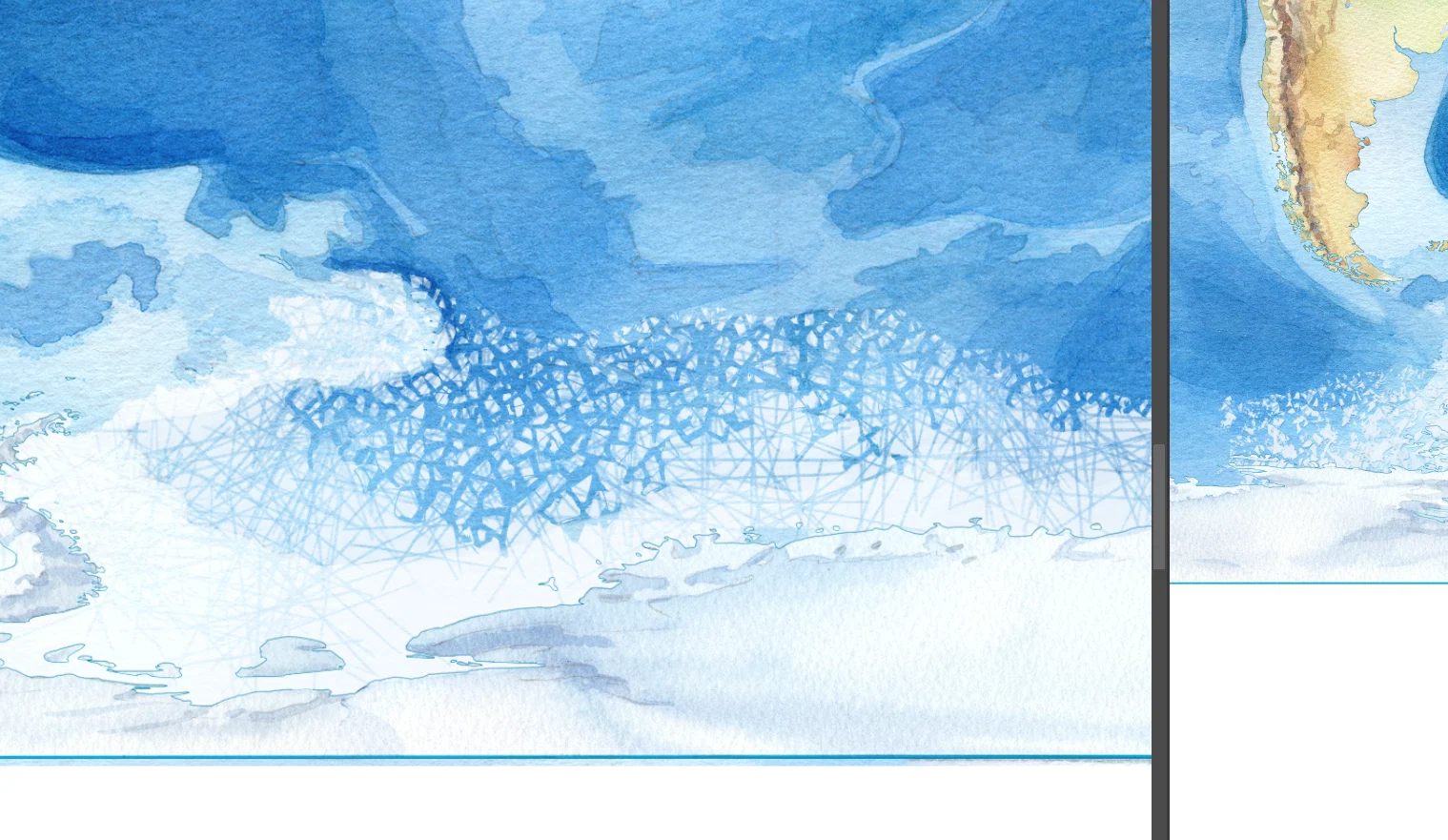
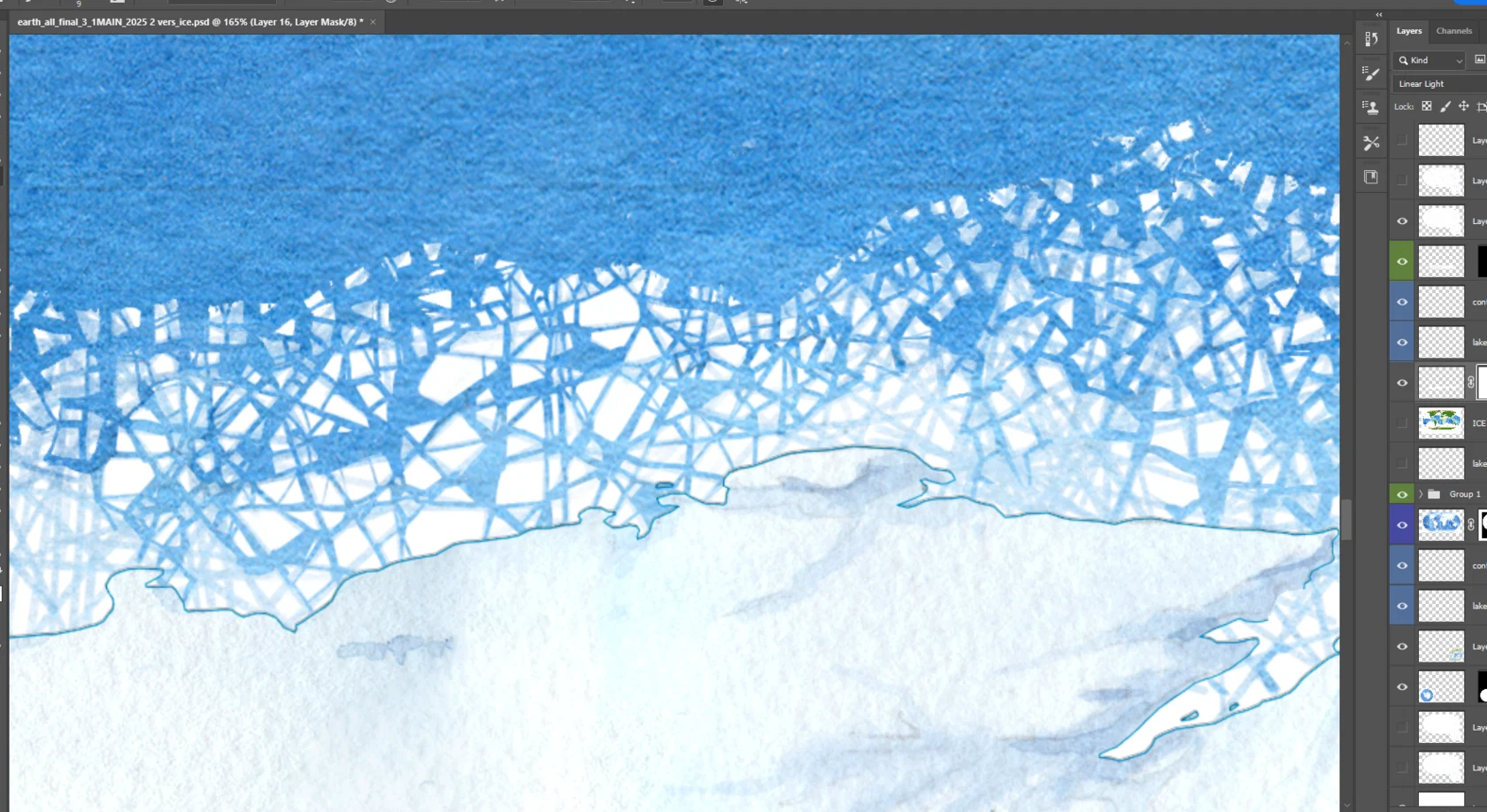
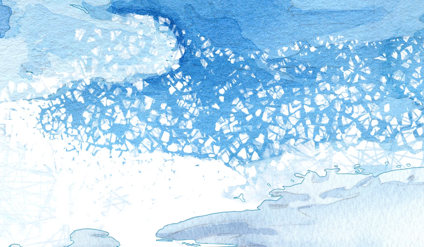
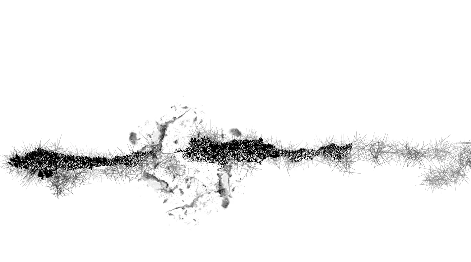
First I searched for the right approach. Then I tried to match it to the map and its scales. Then I hunted for a way to make all those ice floes work in a single visual key. I printed, compared with reality, showed it to the team. The guys said the ice couldn’t possibly break along the logic I’d invented. I was angry at them, then agreed, went back, reshaped and shifted the floes.
In the end, the ice took more time and nerves than all the continents and oceans combined. But its “crumbly” texture perfectly tied together the precise, carefully balanced layout and the hand-painted watercolour. The ice became a visual bridge in the graphic language.
In the end, the ice took more time and nerves than all the continents and oceans combined. But its “crumbly” texture perfectly tied together the precise, carefully balanced layout and the hand-painted watercolour. The ice became a visual bridge in the graphic language.
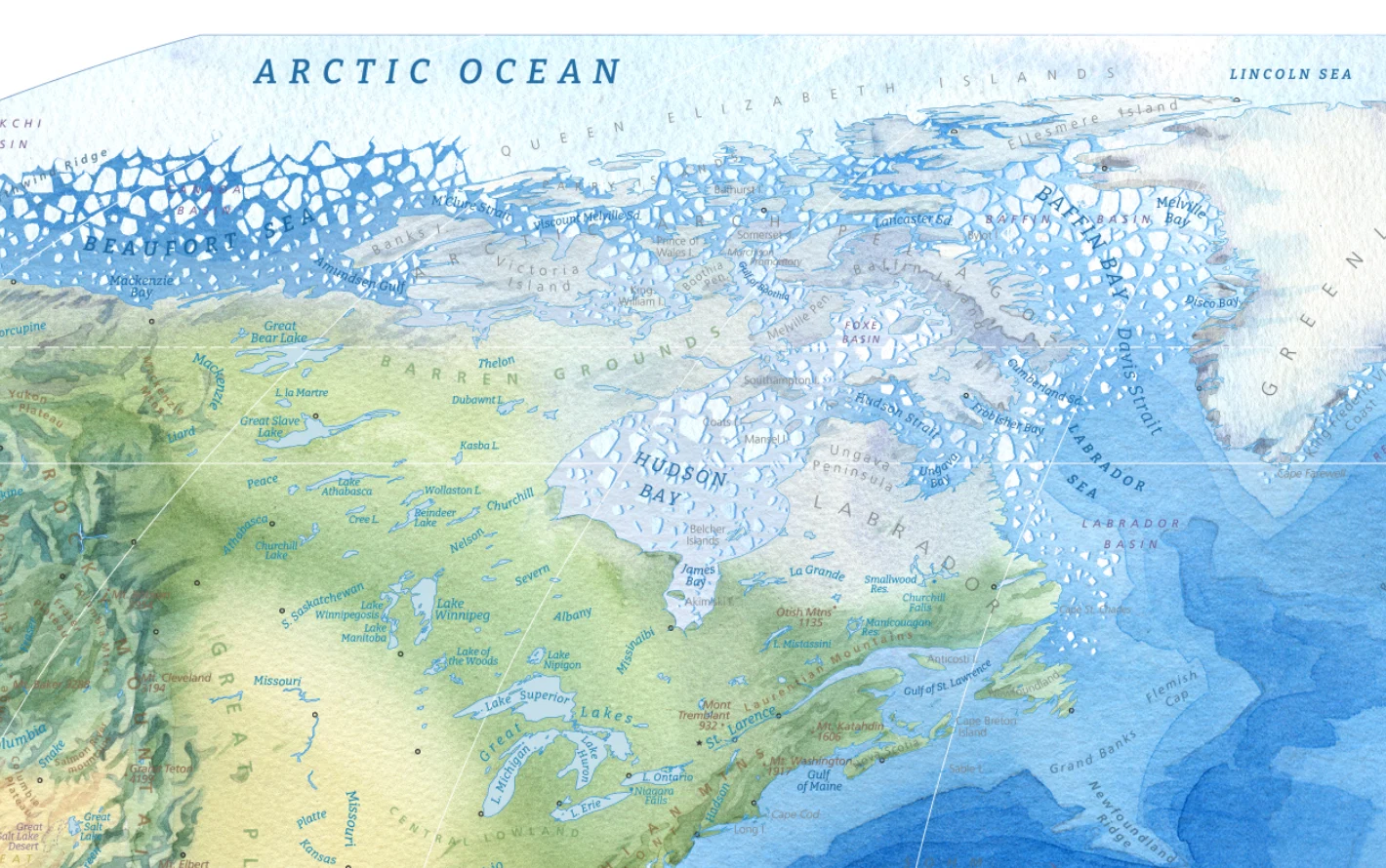
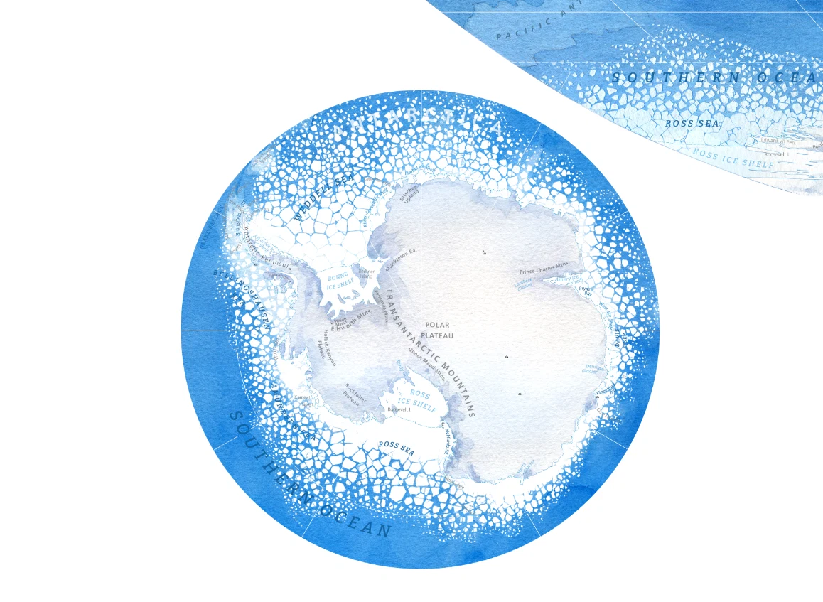
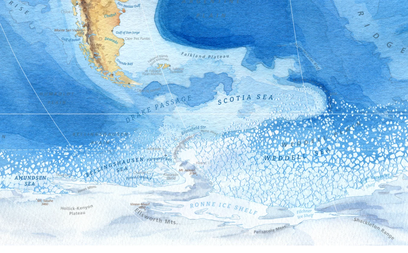
There was a moment when I lost faith in myself. We even discussed releasing the map without the ice caps. eep breath. Exhale. I regained strength, sharpened my axe, and finished the job.
Now I can’t imagine this map without ice. Without it, it feels bare and unwelcoming.
And on my CV I can now officially write: skilled in ice-breaking (in graphic editors).
In a couple of places, I hid Easter eggs. They’re not easy to find, but who knows — maybe you’ll spot them?
Now I can’t imagine this map without ice. Without it, it feels bare and unwelcoming.
And on my CV I can now officially write: skilled in ice-breaking (in graphic editors).
In a couple of places, I hid Easter eggs. They’re not easy to find, but who knows — maybe you’ll spot them?
Sergey Nikolaev
designer
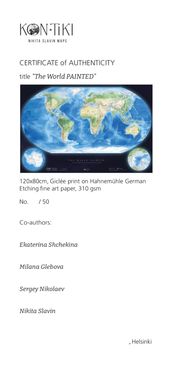
We get down to laying out the certificate.
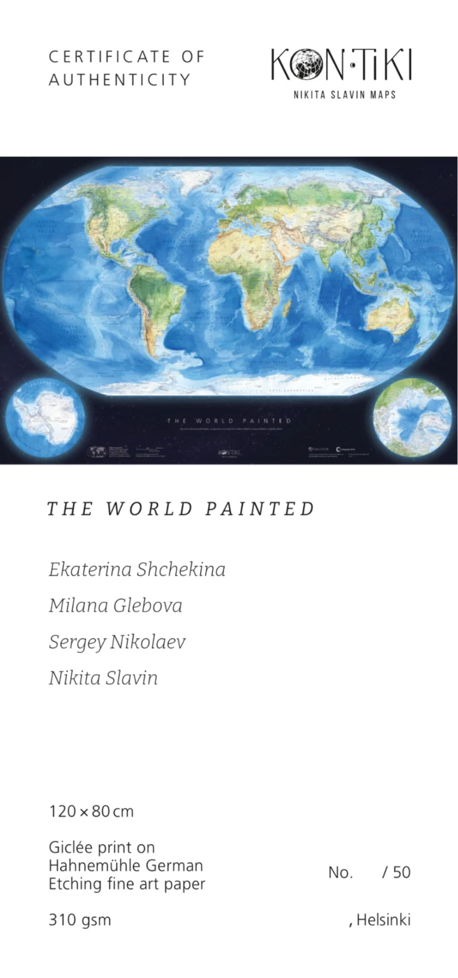
Second attempt: we break the continuous text into sections and arrange them across the layout.
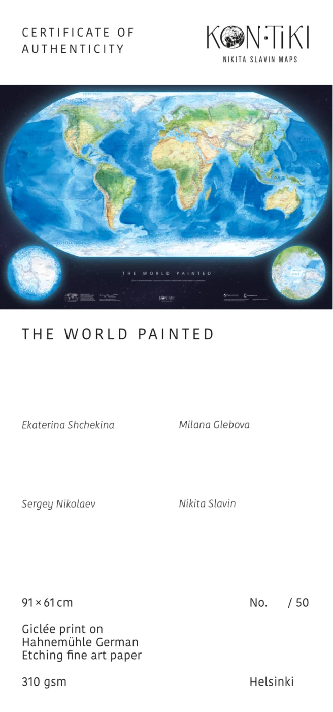
We change the fonts and position the names so that space is left for the signatures.
Nikita Slavin
cartographer
A huge thank you to everyone who helped bring The World Painted to life — we’re a stubborn, slightly mad, and perfectly complementary team of professionals!
Created by
Ekaterina Shchekina
Milana Glebova
Sergey Nikolaev
Nikita Slavin
Acknowledgements
Luke Harvey
Nat Slaughter
and our friends, for their patience and encouragement
Created by
Ekaterina Shchekina
Milana Glebova
Sergey Nikolaev
Nikita Slavin
Acknowledgements
Luke Harvey
Nat Slaughter
and our friends, for their patience and encouragement